

Ventur
A DTC AI-powered mobile app that helps climbers make informed plans on how to navigate properly, climb safely, and enjoy the outdoors.
Overview
Ventur is a DTC AI-powered mobile app that helps climbers make informed plans on how to navigate properly, climb safely, and enjoy the outdoors. Climbers have historically had problems finding accurate information on routes they’re unfamiliar with, have run into navigation issues finding climbs, and have had trouble identifying the correct route when they’re at a crag. I designed this AI-powered app to assist climbers with all of these tasks.
Role
Product Designer and UX researcher
Tools
Figma, Adobe Illustrator, Google Docs, Sheets, Forms
Duration
~16 weeks
Problem
It can be daunting and dangerous trying to navigate outdoor climbs when unfamiliar with a climbing area as an intermediate climber. It’s vital that climbers have the necessary information to avoid dangerous situations; 57% of climbers report that they don’t have enough information about a route before they start climbing it. This highlights the need for accessible, reliable route information to ensure both safety and confidence on every climb.
Solution
Ventur is an AI-powered app that helps climbers solve these problems by:
Studying users' climbing preferences and history to provide personally tailored route recommendations.
Showing climbers AI-supplied imagery for them to cross-reference against the crag so they know they're starting at the correct location.
Providing GPS location services for navigation purposes.
Providing real-time weather updates.


Discovery
Secondary Research
I conducted secondary research to understand what prevents climbers from transitioning from indoor to outdoor climbing or from progressing once they are outside.
User Challenges
Using websites and printed guidebooks, I identified key challenges:
Planning, navigation, and route identification; a lack of reliable information can lead to poor preparation and risky decisions.
Shortcuts can cause accidents; difficulty navigating approaches can result in getting lost or caught in unsafe conditions.
Ignorance around land ownership or closures can lead to unintentional harm or illegal activity, and not knowing how to descend may cause gear loss, injury, or disorientation.
AI Capabilities
I conducted online research using articles on recent AI technologies, analyzing successes, failures, and areas for improvement.
Key findings:
Accuracy is critical.
Pricing errors are costly, and factual mistakes risk losing user trust.
Slow personalization can drive users to alternative products.
Primary Research
My goal was to identify key obstacles climbers face when planning outdoor climbs to better support confident decision-making. Surveys were used to gather insights.
Key questions focused on how climbers choose areas and routes, how they identify routes once on-site, and what factors beyond grade difficulty influence their decisions. Additional questions explored user experiences with AI in web/apps. The 10–15 minute survey was shared via general online forums, Mountain Project forums, and my climbing network. Of 83 responses, 23 were usable after screening for relevant participants.
Synthensis
Key Takeaways on User Challenges
The survey identified issues climbers faced when planning a day of outdoor climbing as well as navigating the day once they’re “in the field.”
Theme 1: Usability Challenges with Route Identification
The majority of users reported difficulties identifying specific routes once at the crag due to inconsistencies in guidebooks/apps.
Landmarks in the field often look different from reference images or have changed over time (missing trees, eroded paths).
There is a frequent mismatch between the number of routes physically present and what is shown in apps or books.
Theme 2: Planning Friction Due to Incomplete or Outdated Information
New routes are not documented in existing guidebooks or digital platforms, making it hard to plan accurately.
Climbers prefer going to familiar spots or relying on word-of-mouth due to a lack of trust in existing tools for discovering new locations.
Theme 3: Decision-Making Complexity at the Crag
Users consider many non-grade factors like bolt placement (safety), route length, sun/shade, and mental state before deciding to climb.
Some climbers have ended up on harder routes than intended, which is dangerous and undermines confidence.
Theme 4: Environmental and Access-Related Frustrations
Weather, parking, access issues, and overcrowded crags frequently cause users to abandon or adjust climbing plans.
Lack of updated access information can lead to illegal or unsafe decisions (e.g., crag closures or land ownership issues).
Key Takeaways on AI Capabilities
The survey identified issues climbers faced when planning a day of outdoor climbing as well as navigating once they’re “in the field.”
Theme 1: Accuracy and Trust Deficiencies
Multiple users highlighted experiences with AI tools delivering incorrect or misleading information.
This inconsistency significantly erodes trust; even a single bad interaction can discourage continued use.
Vague or inaccurate answers from tools like ChatGPT reduce perceived reliability.
Theme 2: Transparency and Awareness Gaps
Many users did not realize they were interacting with AI tools, leading to confusion or misplaced expectations.
Lack of transparency about what data is used or how it is processed causes discomfort, especially regarding privacy.
Empathy maps
By creating empathy maps, I was could deeply understand the target audience's perspective, including their thoughts, feelings, behaviors, and environment.
User Insights
Survey analysis informed empathy maps, clarifying user frustrations. The user empathy map captured climbers' challenges, fears, actions, and feelings around outdoor climbing to guide targeted solutions.

AI Capability Insights
The AI empathy map captured users' experiences, frustrations, and trust concerns with AI, highlighting the need for accurate, personalized, and privacy-focused features to guide design.

Jobs to be done
I used Jobs to be Done to pinpoint when users face climbing challenges, helping identify core needs and effective solutions.
When planning an outing, I want to read accurate and robust route descriptions so I can pack correctly and focus on climbing and fun.
When arriving at a trailhead, I want to know approach details so I can start my climbing day knowing how to get to the crag.
When I am at the crag, I want to have a rough idea about what I want to climb so I can enjoy my time outdoors doing something I love with good people.
Use cases
User needs and identified jobs to be done guided Ventur’s design, ensuring the app remained focused, streamlined, and equipped with features that add value. Use cases were developed to align the app’s AI capabilities with users’ specific goals and challenges, illustrating how it supports them in real-world climbing scenarios.
User need 1: The user needs accurate and robust route descriptions so they can pack correctly.
Context: The user is in planning stages (with access to WiFi) or at the crag (may or may not have access to wifi) and needs route descriptions and weather information for making route and timing decisions.
Web/App AI capabilities: Can make route suggestions based on climber data (style, preferred grades, favorite areas, etc.) while taking weather into account.
User need 2: A user needs to know how long it will take to get to a crag and be confident they’re going the right way.
Context: When leaving home, arriving at the trailhead, and beginning navigation to the crag, the user needs to know distances and travel times of each step of the process.
Web/App AI capabilities: will provide GPS to guide the user from home to the parking lot to the crag.
User need 3: The user needs to be able to confidently identify routes.
Context: At the crag, the user needs to be able to correctly identify routes.
Web/App AI capabilities: can supply photos so the user can check against features in the photos to match features they see in the rock to identify routes.
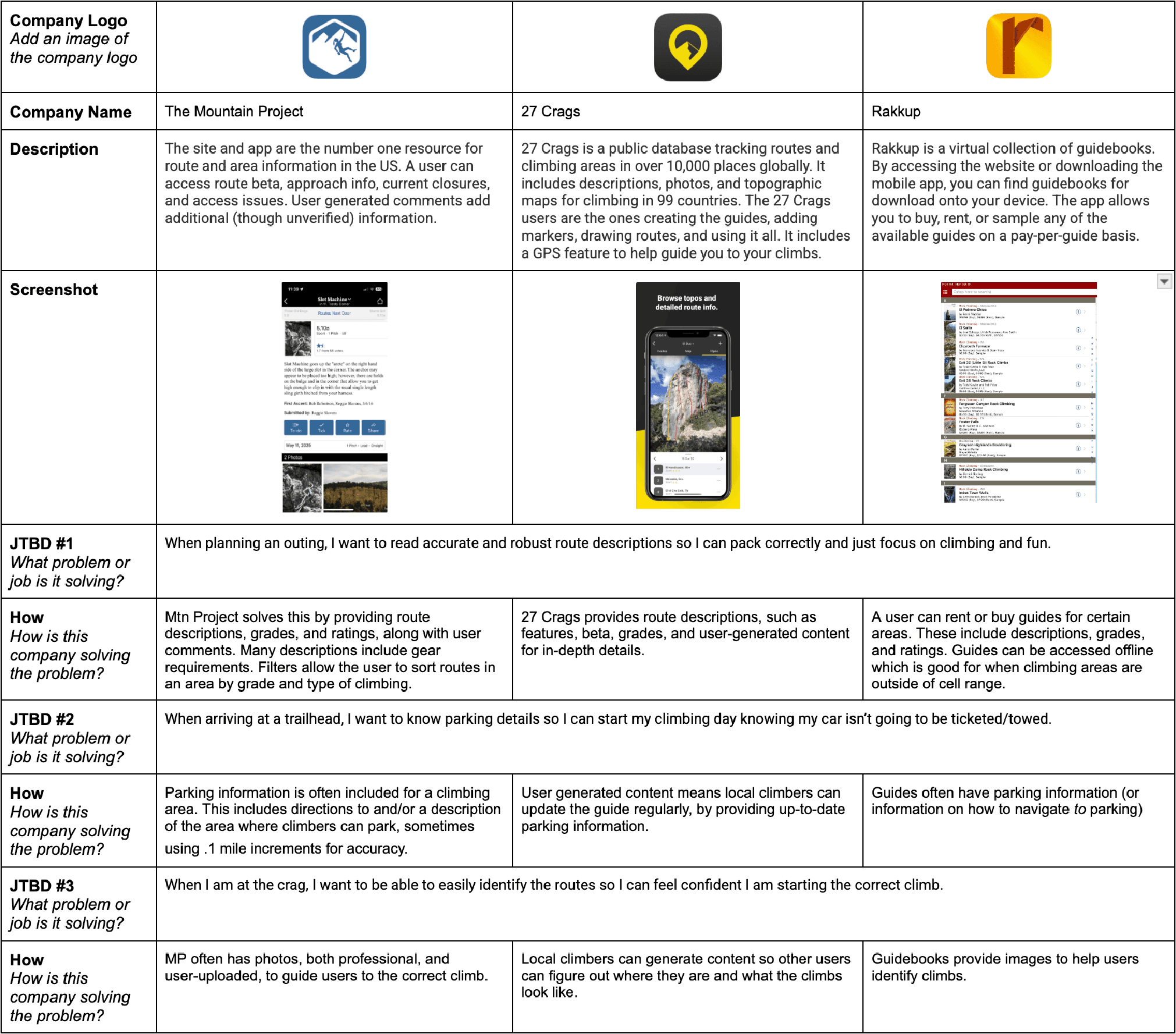
Competitive Analysis
I conducted competitive analysis of three popular climbing apps—Mountain Project, 27 Crags, and Rakkup—to understand existing features and identify areas for improvement.
Ideation
How Might We Statements
“How Might We” statements reframed climbers’ outdoor challenges as opportunities for solution-focused design. They prioritized user needs, encouraged AI-driven innovation, and streamlined the design process by removing unnecessary steps.
HMW #1 AI Capability:
Pain Point: Getting accurate route descriptions
HMW Statement: How might we help users get in-depth outdoor route descriptions?
AI scans resources like online guidebooks, user reviews, GPS, images, and online route databases to generate accurate route descriptions.
AI compiles real-time input from recent climbers (e.g., condition notes, beta tips, hazards) and presents annotated overlays on the route description—with filters for time of visit, skill level, and climbing style.
AI analyzes climber logs, local guidebook data, and regional climbing forums to call out updates within a description, such as spinning bolts, a hold that has broken, etc.
HMW #2 AI Capability:
Pain Point: Climbers are unsure of how to navigate from door-to-parking and parking-to-crag
HMW Statement: How might we provide climbers with detailed navigation?
AI scans government websites and other climbing resources to provide the most accurate parking information.
AI references imagery from Google maps to provide satellite imagery, so users have multiple reference points for verifying proper parking, and AI can show user-supplied photos to climbers so they know what parking areas look like when areas are pull-offs and not established parking lots.
AI compiles parking details such as number of spots, parking fees, permit requirements, proximity to the trailhead, and access hours.
HMW #3 AI Capability:
Pain Point: Climbers struggle to identify the route they’re starting
HMW Statement: How might we help climbers identify a route?
AI scans current databases for climbs to produce an image from the base of a climb, so when climbers are at the crag looking up, they can compare imagery with what they see.
AI can make use of high-end GPS devices (like for surveying and engineering) to achieve centimeter level accuracy (2 cm or .75”) so climbers know they are at the correct climb.
AI can scan user-input for significant features on the ground or route for verification.
Brainstorming
HMW #3 AI Capability:
Pain Point: Climbers struggle to identify the route they’re starting
HMW Statement: How might we help climbers identify a route?
AI scans current databases for climbs to produce an image from the base of a climb, so when climbers are at the crag looking up, they can compare imagery with what they see.
AI can make use of high-end GPS devices (like for surveying and engineering) to achieve centimeter-level accuracy (2 cm or .75”), so climbers know they are at the correct climb.
AI can scan user input for significant features on the ground or route for verification.

User Stories
User stories describe the features of the app. They’re written from the users’ perspectives and acknowledge what they want to accomplish using the product. By selecting high-priority stories, I ensured alignment with user requirements. The process helped develop AI capabilities that directly address user needs, making the app as useful as possible for the end user.
As a user, I want AI-generated robust route descriptions so that I can choose routes best suited to my abilities and preferences. This story was selected because it was the most personal piece of the AI capabilities.
As a user, I want route grades with up-to-date user-input ratings, so I can determine if I want to attempt a route. This speaks directly to climber safety. Without this accuracy, climbers don’t know what they’re getting into.
As a user, I want recommendations based on my climbing history, so I can continue to grow as a climber. Getting recommendations is only useful if those recommendations work for that individual climber. AI technology uses the climber’s historical data to recommend routes they’ve rated highly and with features they’ve selected as enjoyable.
As a user, I want detailed AI-powered GPS navigation, so I can make my approach as quickly as possible. A number of climbers shared stories of times they found themselves wandering around looking for the crag, wasting time. AI would help them cut down on this “lost” time and get them doing what they set out to do faster by providing accurate directions.
As a user, I want quality images from the base of the climb, so I can begin a climb knowing I’m beginning the correct route. This also speaks to the climber’s safety by helping them identify the route with AI-supplied imagery. Reading a description is often not enough, and this technology would allow the user to cross-reference the written description with a visual aid to help them match features on the wall they’re in front of with the images in the app to make sure they’re starting the correct route.
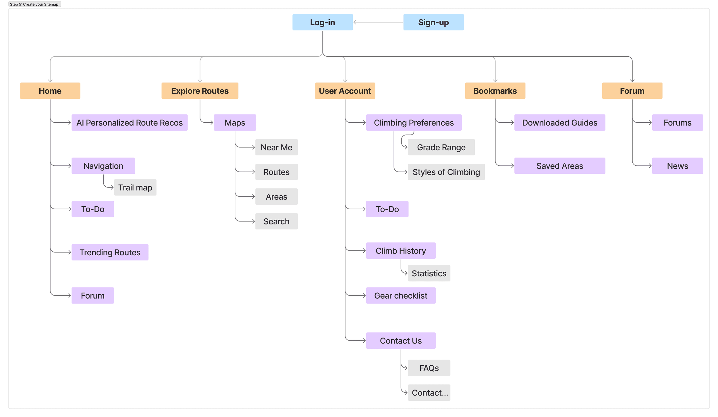
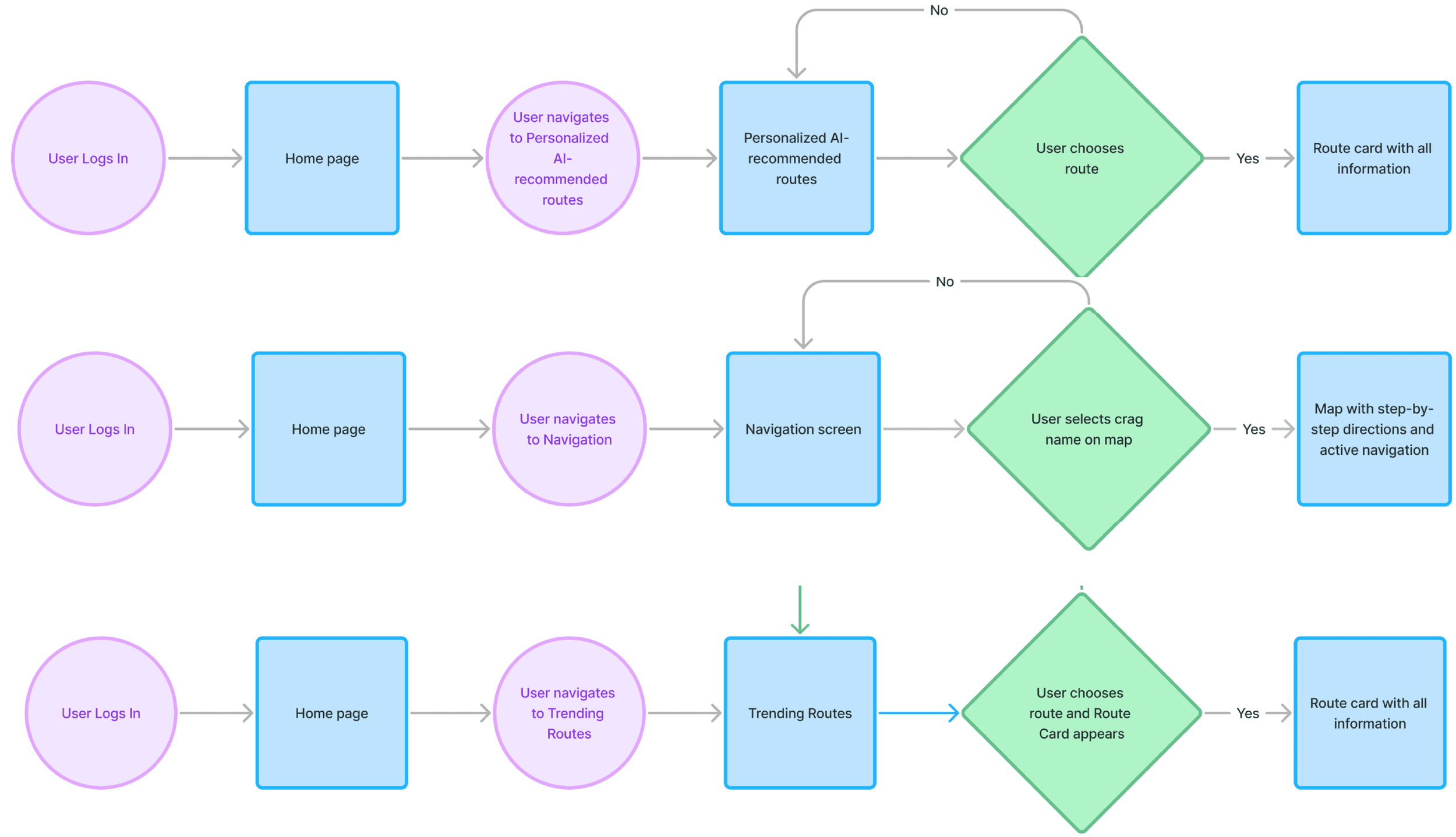
User Flows
I created user flows so I could see how the user would begin the process of completing a task. By visualizing this graphically, I revealed task frequency and dependencies. The two most common tasks were finding new routes (recommended by AI) and navigating to routes using AI GPS. Looking at the user flow, I began to see how the app might function most efficiently by centering these tasks first, without getting held up on visuals.
Sketches
I started sketching as the quickest way to begin visualizing what a physical design might look like. Sketches were iterative because I kept revising initial sketches. It was a great way to start visualizing user flow in a concrete way. Sketching was a rapid way to see how to get the most-sought-out features in front of the user, while making secondary and tertiary features accessible in a sensical way, but keeping them from being intrusive to the primary features.

Design
Wireframes
Wireframing was vital for the quick creation of elements. With user experience top of mind, I continued to refine actions and elements by paying close attention to hierarchy.
The transition from lo- to med-fi included adding real text for placeholder shapes, beginning to develop icons and buttons, refining spatial hierarchies, adding the status bar at the top and the nav bar at the bottom, aligning objects to a grid system, specifying input fields, etc.
I was beginning to learn what elements were taking up too much space, what elements needed more space, what fields would need more breathing room, etc.


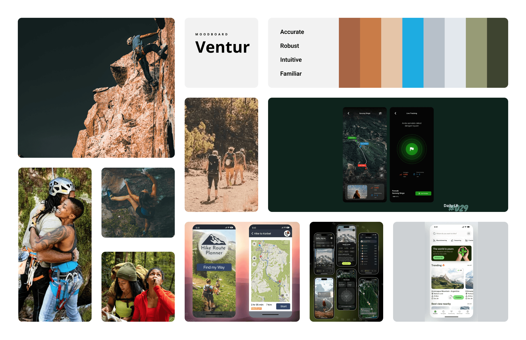
Moodboard
I created a moodboard to communicate a deeper sense of user personas, design styles/inspiration, and brand personality. I wanted to get a sense of color palette, design aesthetic, and user expectations.
The moodboard was created to visually represent aesthetic, style, and mood for Ventur. The inspiration was to create a design that is clean, inspiring, and user-friendly, while using vibrant, natural colors found in rock. I aimed for an aesthetic with minimal–but vital–imagery to condense information, and get the climber climbing as soon as possible. My goal was to make climbing accessible and safe for users, instilling confidence in their decisions. The name, "Ventur," was chosen because it’s a shortened version of avventura, which is Italian for “adventure,” and Italy is known for having great climbing routes.
Brand Platform
I created a brand platform to communicate what Ventur is, what problems it solves, and how. Keeping its mission and vision at the forefront of the design process kept me focused on the defined goals. Ventur captures a world where climbers use technology to help them make informed plans to navigate properly, climb safely, and enjoy the outdoors. I chose this vision because safety should never be compromised. Ventur is a product that connects technology with climbers to help them achieve their goals through accurate information and access. Ventur is your climbing partner who has been everywhere, climbed everything, and remembers all the details.
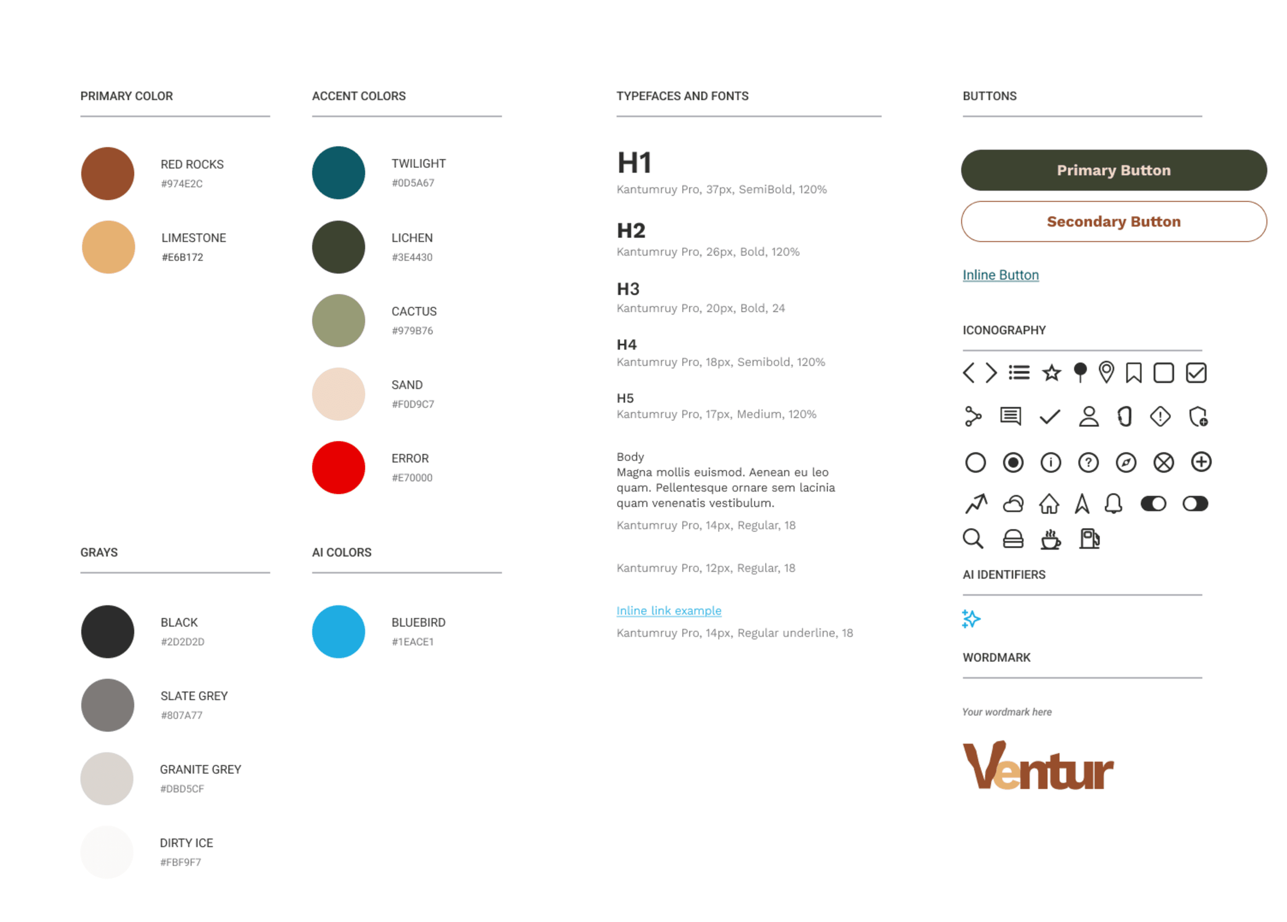
Style Guide
Ventur’s style guide was created to ensure consistency within the app's design elements and make sure screens were designed cohesively. This enhanced the user experience by creating consistency across pages. My brand platform provided much of the foundation for the mission and vision; from the mood board, I was able to select colors directly from the images of natural rock that represent strength and reliability, as well as the natural world.
“Red rocks” and “Limestone” were chosen as primary colors because they’re found in nature and are vibrant, cheerful colors that work well opposite both black and white. The font (Kantumruy Pro) was selected because it is a very clean, concise sans-serif font with easy readability. The icons I sourced or developed on my own lean minimal but with enough detail to be easily readable.
The style guide provides color builds and names, iconography, typography, buttons, and other hierarchies to make sure any designer could enter the process and design within Ventur’s brand personality.
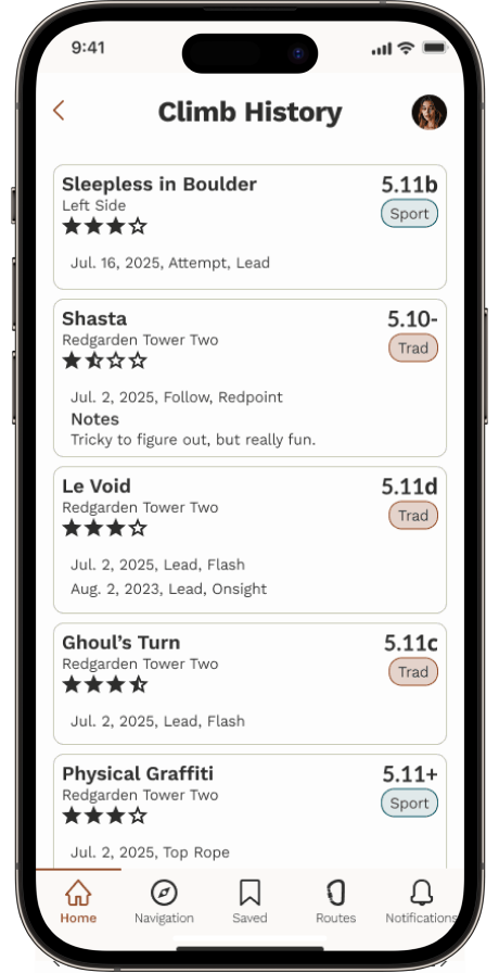
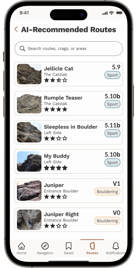
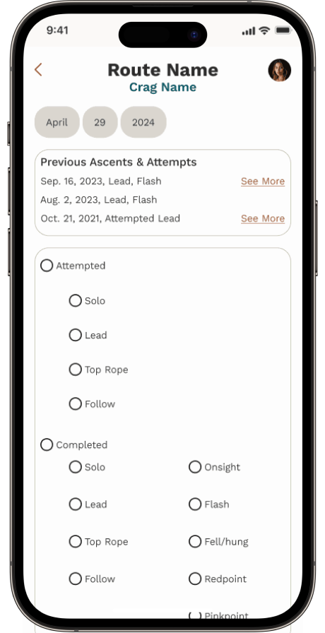
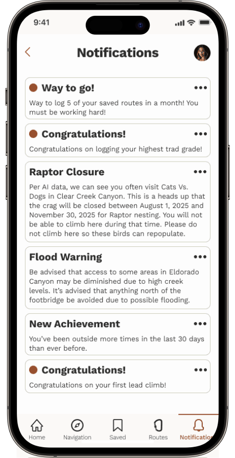
Hi-fi wireframes
I created hi-fi screens to show real-world versions of how the app would look and perform. The transition from med-fi and hi-fi integrated Ventur’s color story, typography, full iconography, and photography. The style guide was crucial for maintaining consistency across elements like iconography, typography, colors, imagery, and layout. Transitioning from med-fi to hi-fi designs, I refined elements according to the style guide and incorporated additional details like stroke weight and corner properties to give the design a polished look.
Throughout this transition, I could see the significance of attention to details such as type, spacing, color consistency, and alignment. This reiterated my understanding of the profound impact these nuances can have on the overall aesthetic and functionality of the design.


Prototype
The prototype was created in Figma to simulate user interaction and functionality within the app. This allowed for testing both functionality and design flow. This process was a good way to challenge efficiencies in both the design and the design process.
Testing
Usability Testing
Usability testing was conducted to identify potential design flaws, oversights, and areas for improvement to gather constructive feedback. Five participants were recruited via personal outreach to do remote moderated testing through Zoom.
Participants tested 3 tasks:
Get AI-generated route suggestions.
Get AI-powered GPS navigation from the parking lot to the crag.
Get AI-supplied images from the base of the climb.
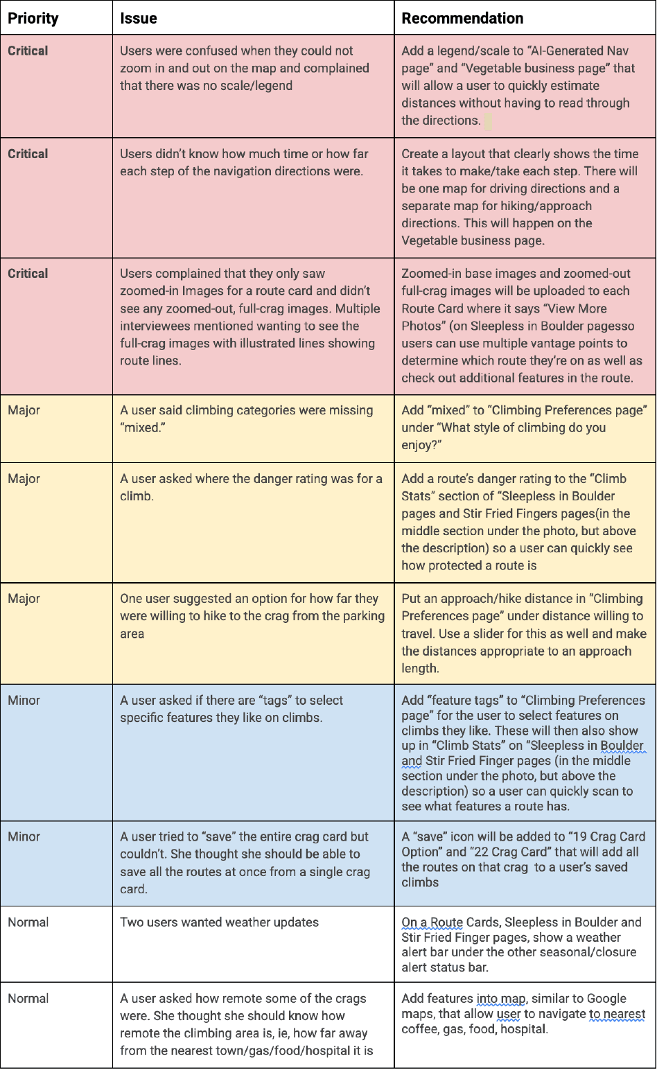
Critical issues noted:
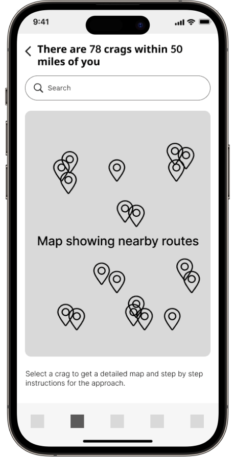
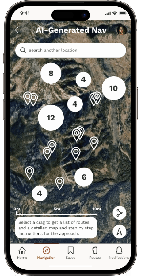
Map functionality lacked the ability to zoom and lacked a scale.
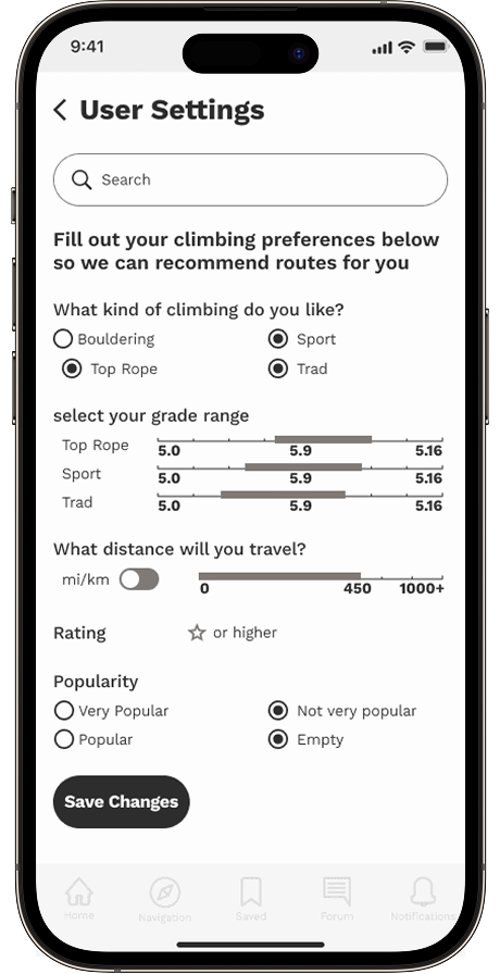
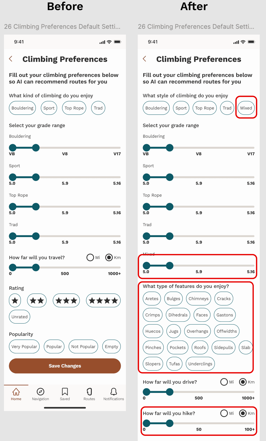
There were some missing features in “climbing preferences” such as “mixed” as a category of climbing, willingness to hike a specific distance, and feature tags.
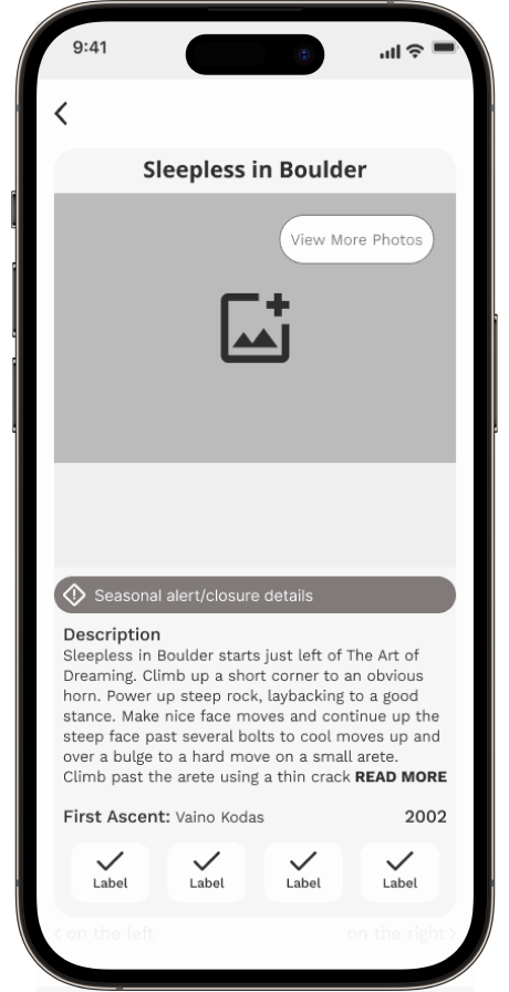
Route cards need to include a danger rating, among other small things.
Addressing the issues one by one, I determined which were most vital to a user’s safety versus a personal preference and addressed them in that order. In the end, I made every update except for adding a “partner finder,” as I felt that fell outside the scope of Ventur’s mission and functionality.
Redesign
After usability testing was completed, I incorporated feedback and iterated on the design to create versions that better meet user needs and expectations.
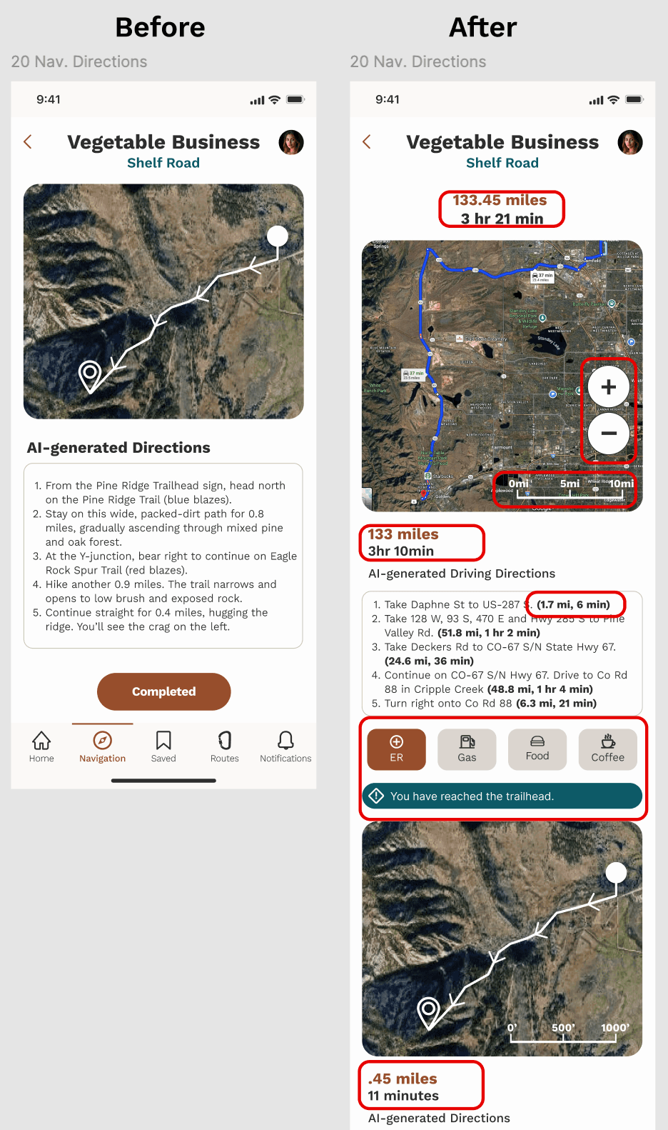
Issue 1: Users didn’t know why they couldn’t zoom in on a map. They also needed a scale to get a sense of distance. They wanted to see both driving and approach directions. Knowing the remoteness of a crag came up with one user.
Before: Only one map of the total route was shown; no scale; not zoomable; no distances/ETA.
After: The map was redesigned to have a zoom function, a scale, and be divided into (1) a driving portion and (2) an approach portion. Each step has an individual distance and time added to it for increased information. Buttons were added to give directions to the closest ER, gas, food, and coffee.
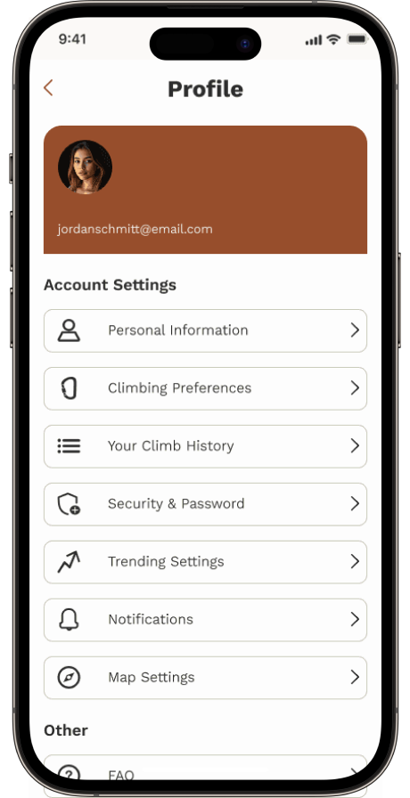
Issue 2: Users wanted to see more customization variables in "Climber Preferences."
Before: there were too few parameters in climbing preferences.
After: all user suggestions were added to “climbing preferences.” These parameters would commonly show up in route descriptions and would assist AI in further tailoring its recommendations.
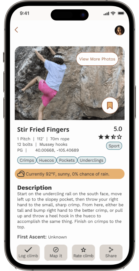
Issue 3: Users didn’t like that there wasn’t a danger rating available. They also wanted real-time weather updates, longitude/latitude coordinates, and main features of a route called out.
Before: there was no danger rating, coordinates, feature tags, or weather information.
After: danger ratings, longitude/latitude coordinates, weather details, and “feature” tags were added to the middle section of a route’s details so they could be quickly accessed without having to read through the entire route description in a placement that does not require scrolling.

Reflection
Seeing the planning stages of research was eye-opening. Many users performed tasks similarly, but testers focused on different priorities, highlighting the need for robust sample sizes. It was challenging to set aside my design background and let users “art direct.” I gained skills in research, ideation, and prototyping.
Testing let me see the product through testers’ eyes and improve usability. Prioritizing users meant giving up some personal preferences for what worked best for them. I especially enjoyed identifying key user needs and developing the style guide.
A large takeaway was being able to shift gears and make adjustments to original objectives to suit user needs, rather than make the user try to work within a product whose functions they don’t necessarily relate to. I gained a thorough understanding of designing AI applications with a focus on user experience.