

ExpoPass
A B2C web and mobile platform designed for professionals and enthusiasts attending trade shows, expos, and conventions, users can easily browse upcoming events, purchase tickets, and customize their schedules by filtering events based on industry, location, or date.
Overview
ExpoPass is a B2C web and mobile platform designed for professionals and enthusiasts attending trade shows, expos, and conventions. Users can easily browse upcoming events, purchase tickets, and customize their schedules by filtering events based on industry, location, or date. The intuitive dashboard allows users to manage tickets, access event updates, and network with other attendees.
Role
Product Designer; research, concepting, design, wireframing, revisions, protoyping.
Tools
Figma, Illustrator, Photoshop
Problem
Busy professionals and enthusiasts don’t have a way to plan all the events they want to go to throughout a year in a single location. Admittance is often purchased from individual event websites and, therefore, all of a person’s event information is spread across platforms like different apps and emails. Tickets may be accessed in an email or from within an app.
Solution
ExpoPass creates a robust filtering system so users can explore all the events globally.
ExpoPass uses a scheduling system so users don’t double book.
ExpoPass keeps tickets in one place so users can access admittance to every event from one location with only their phone.
Overview • Features • Hand-off • Reflection

Features
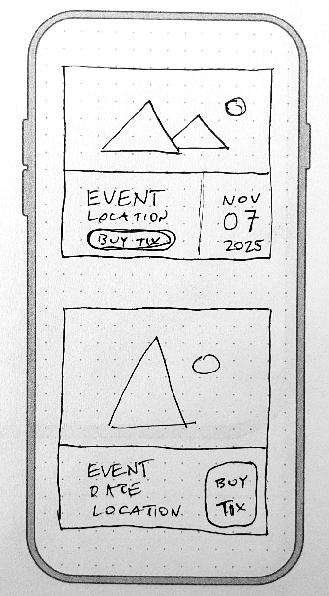
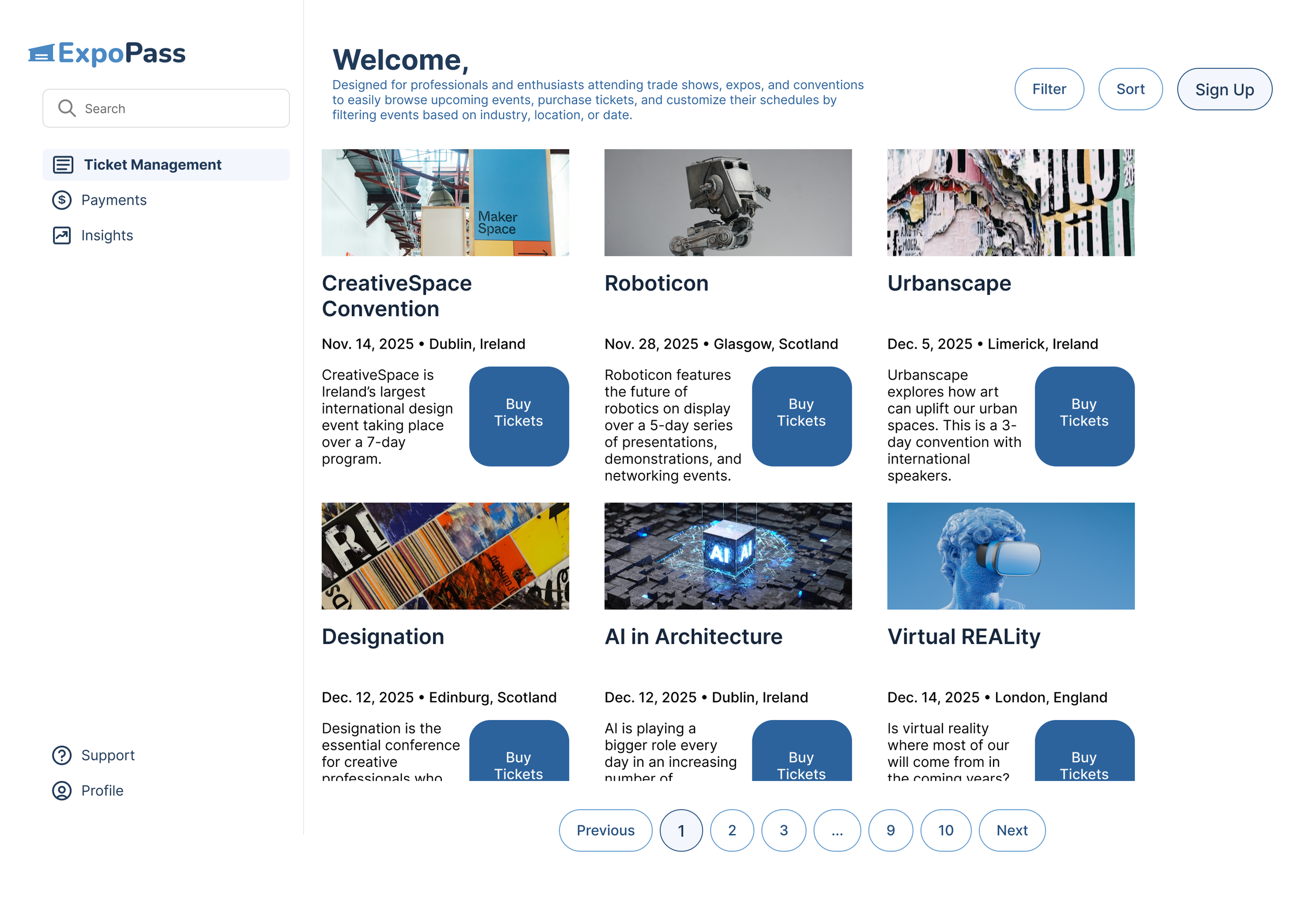
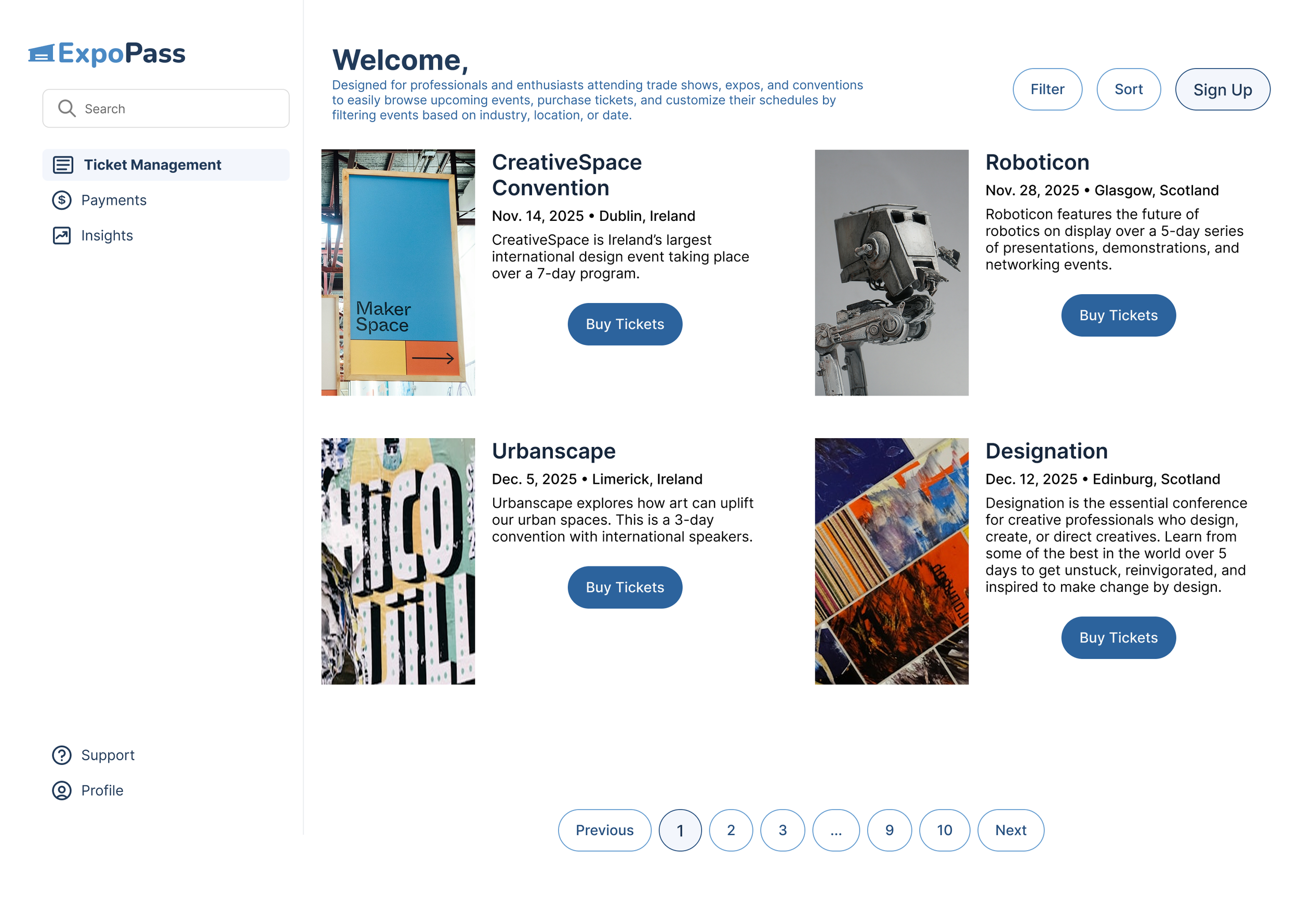
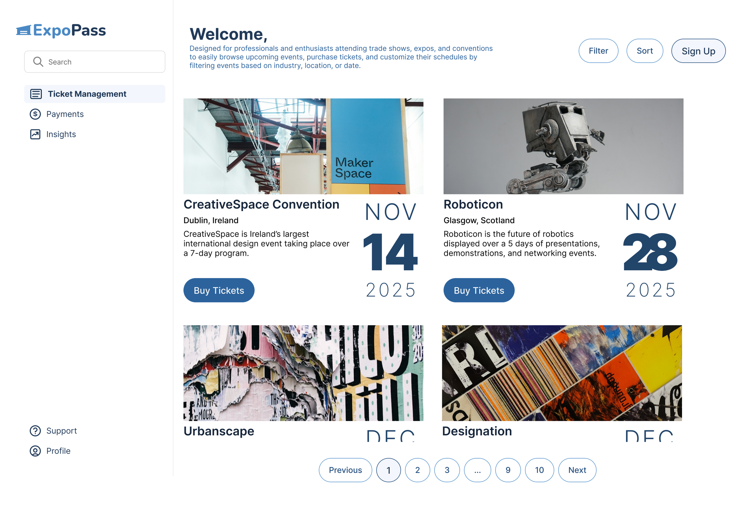
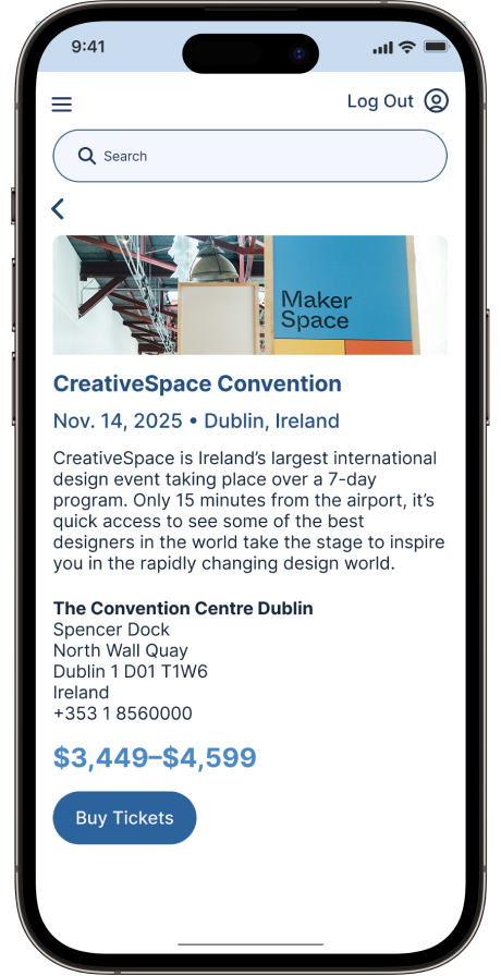
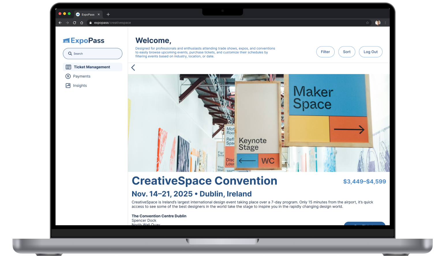
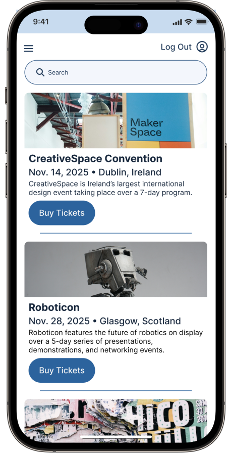
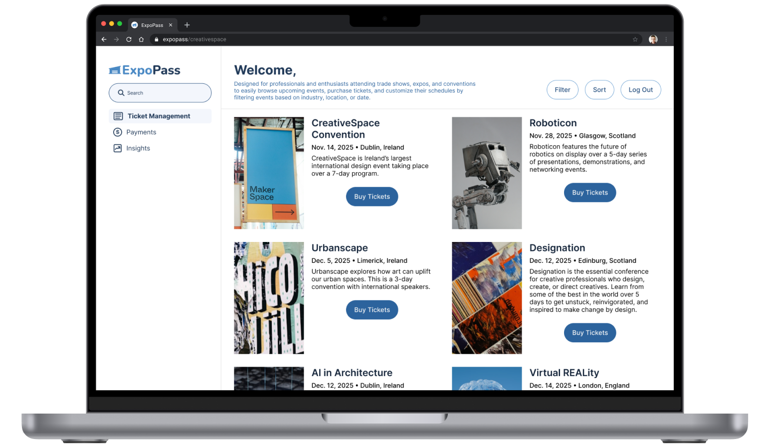
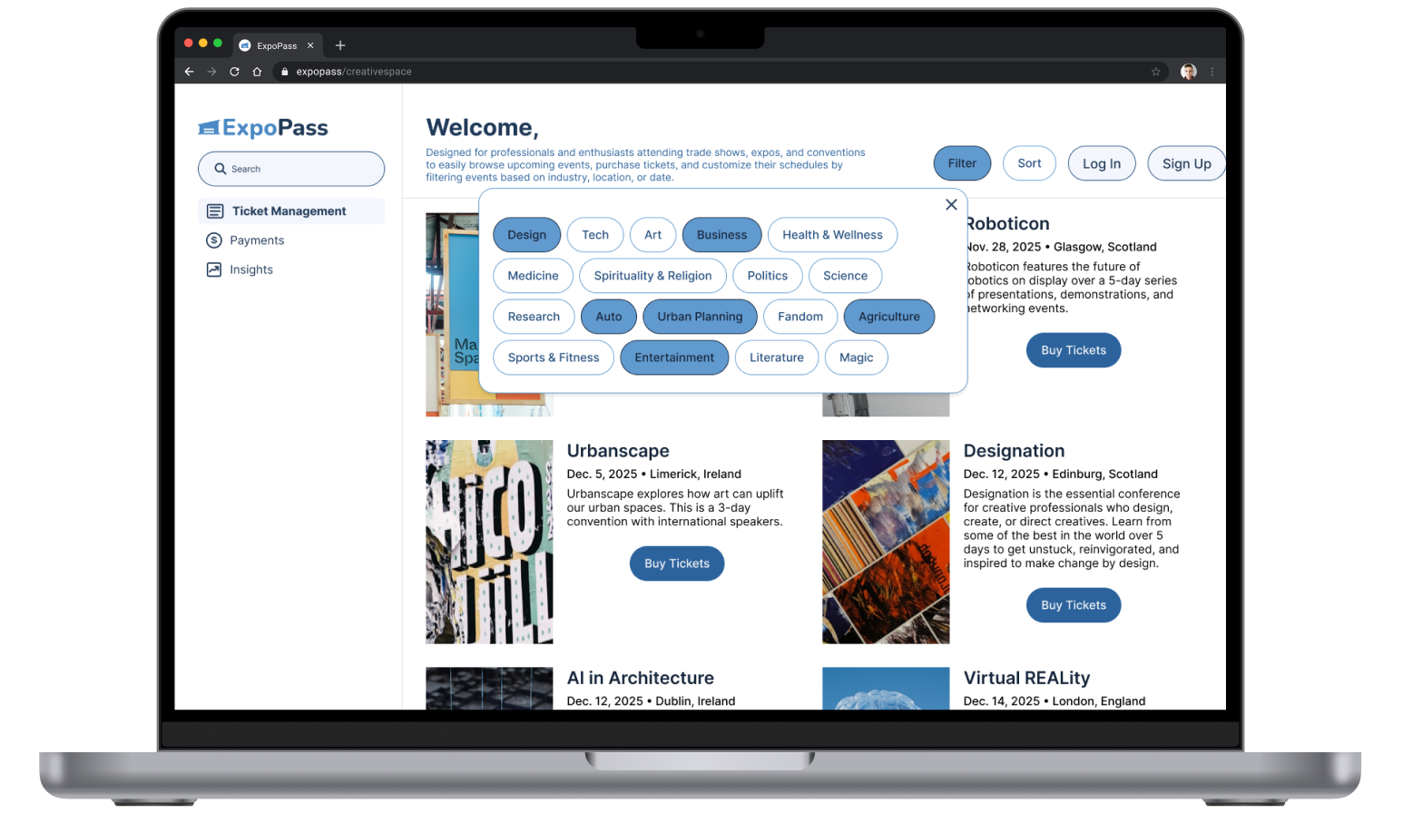
Responsive Card Design
It is vital for the card design to display all the important information about an event so the user doesn’t have to click into the event to find out that information. As such, the card needs to be cleverly designed to have an appealing hero image of the event so it quickly engages users. It must also be responsive, so whether they are looking at a phone, tablet, or computer, the information can be digested quickly and legibly.
My research showed that I needed to include the event title, date & time, location, a visual, and a CTA for the event. Once I established the hierarchy, I made sure the CTA was visible and had plenty of white space around it.
All cards, regardless of the device the user is on, have the same layout to avoid confusion. All colors pass a contrast test. Event descriptions are short and concise. Below are various concepts.

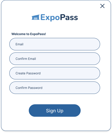
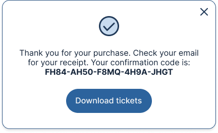
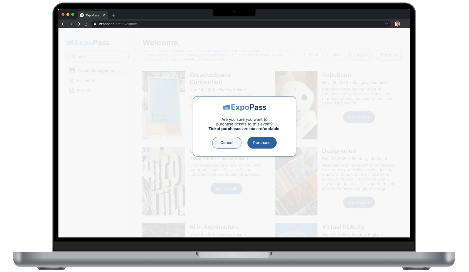
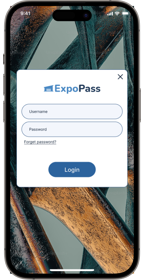
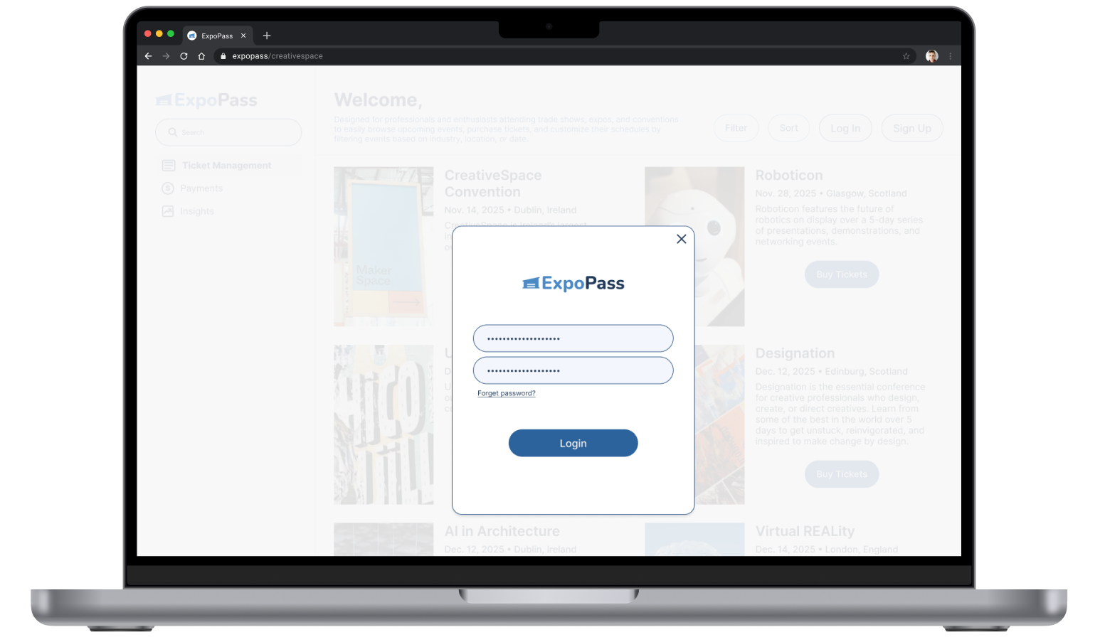
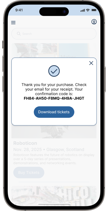
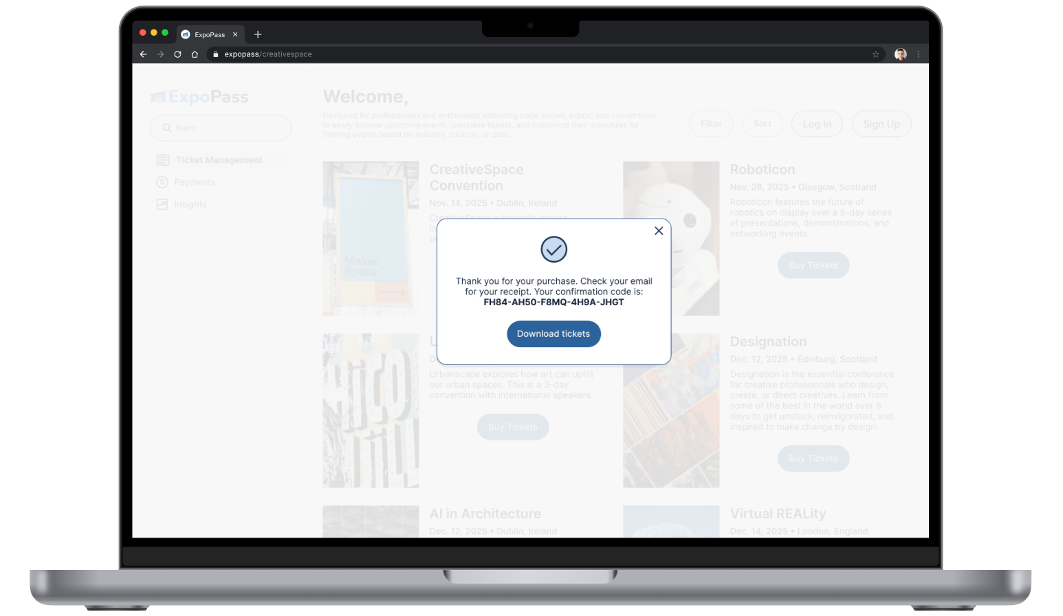
Modal Design
To ensure clarity and consistency, modals were designed as a focused, minimal layer within the interface. Their role was intentionally narrow, supporting only the most critical user actions.
Key design decisions:
Consistency: Standardized width, padding, margins, and alignment create a cohesive system.
Purpose-driven use: Restricted to essential tasks—logging in, account creation, purchasing, and purchase confirmation.
Clarity of language: Copy was kept minimal and direct to reduce cognitive load.
Escape mechanisms: Every modal included a clear, reliable way to exit.
Focused attention: A dimmed background reduced distractions and emphasized the modal content.
Research insights (AI-assisted):
Use modals sparingly to avoid overloading users.
Never stack multiple modals.
Assign each modal a single, well-defined function.


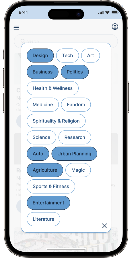
Filtering System
After conducting research and looking at references, I ended up working with two options, pictured below.


I selected the first option, because it translated better to touch zones on mobile/tablet without having to change the design between interfaces, in addition to looking more modern.

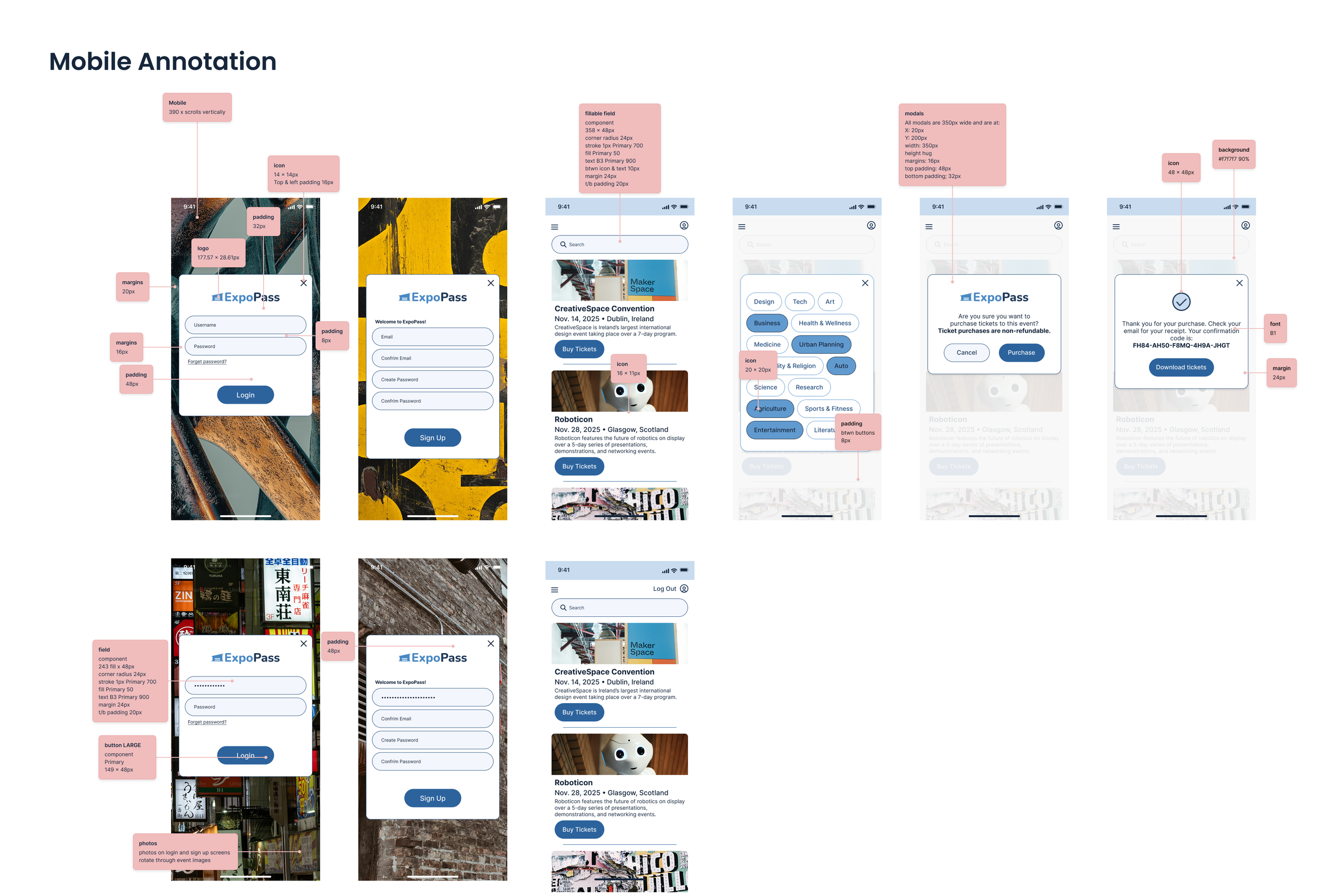
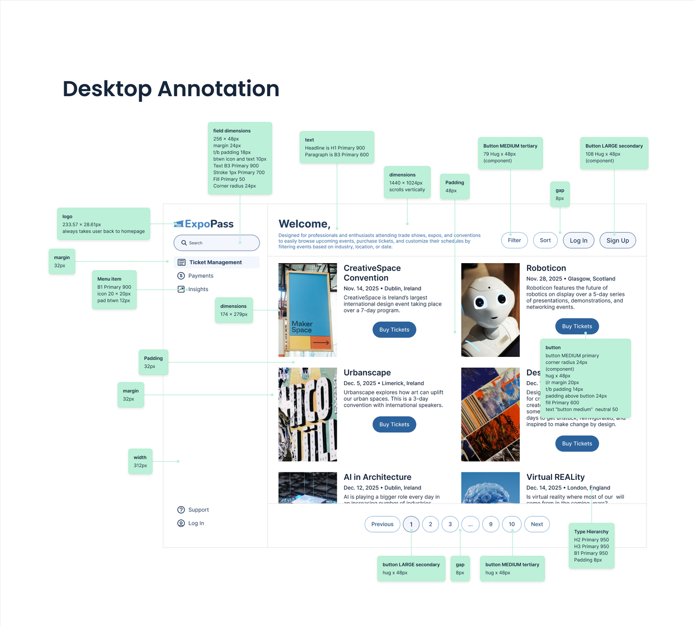
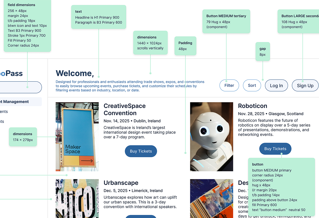
Hand-off
As a mathematician with a history of working with engineers, I wanted to make sure hand-off would be seamless. I created my final files in a single place and then annotated them so anyone coming in at that point would understand my exact intentions for the design. Details included are:
font family, weight, color, size
background color
margins
padding
icon size
card/modal/image dimensions
Prototype
The prototype was created in Figma to simulate user interaction and functionality within the app. This allowed for testing both functionality and design flow. This process was a good way to challenge efficiencies in both the design and the design process. I was able to find some bugs and fix them through this process.
Reflection
Reflecting on the project from start to finish, I realized one can often become overwhelmed by having numerous solutions (or options) to choose from when addressing a need. I could narrow down solutions first by centering on users’ needs. I could further eliminate choices by adhering to brand guidelines. By employing these two methods, I removed any bias from the process, and I focused on the work alone. By that point, if I were still struggling to make decisions, I could choose based on personal aesthetic appeal but could be confident knowing the solution would solve the users’ needs and fit within the brand’s look and feel.