Dogfish Head • Noosa • KeVita • Ascent Protein • ZeroNorth • JD Sports • Groundbreakers • Logos
Dogfish Head
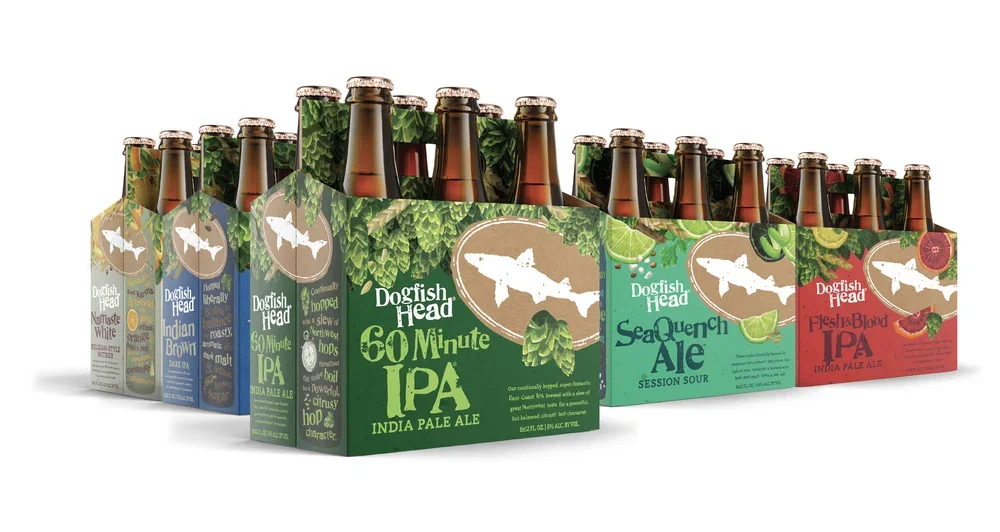
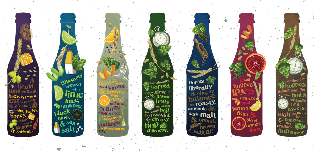
In collaboration with Interact Brands, my role was in layout, typesetting (all packaging copy and a few SKU titles), and color sourcing. The goal beyond ingredient-driven storytelling that worked as a single package, was creating a fully billboarded design when packages are placed side by side on-shelf.
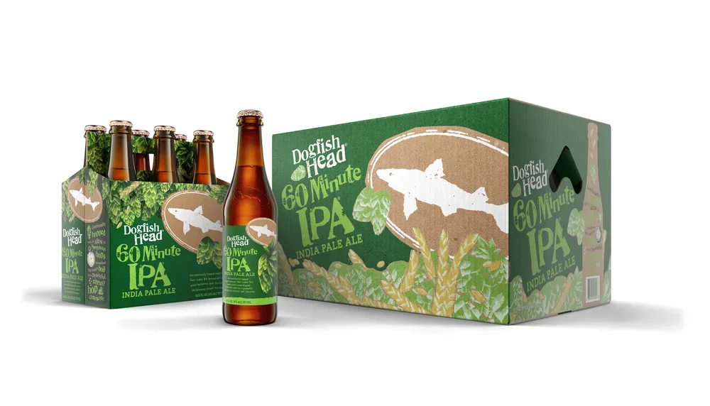
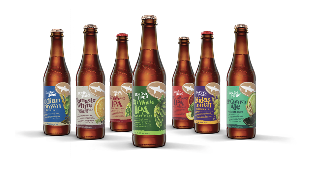
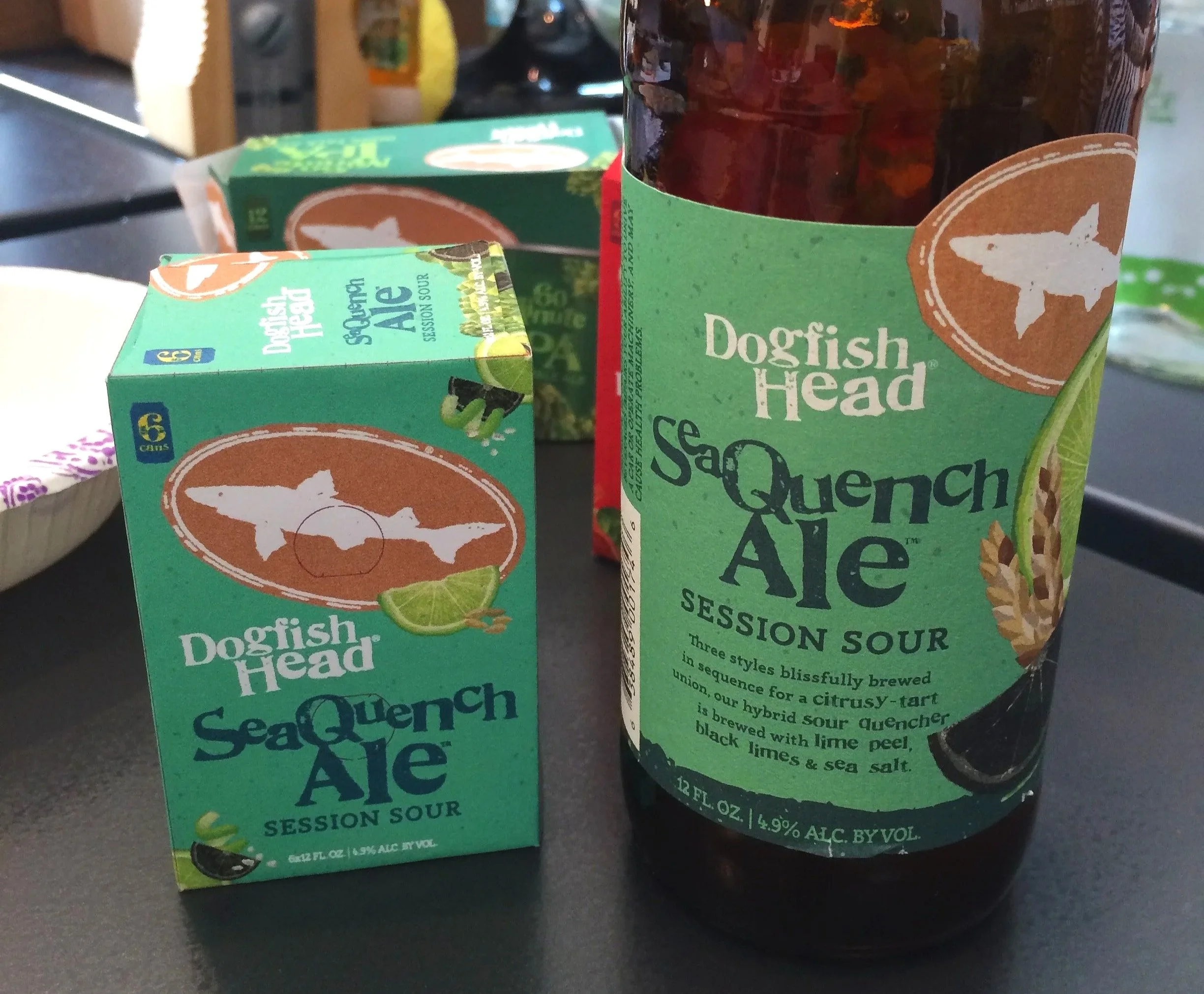
Packaging created: mother cartons, 12-pack cartons (cans and bottles), 6-pack carriers, 4-pack carriers, bottle labels, and cans.
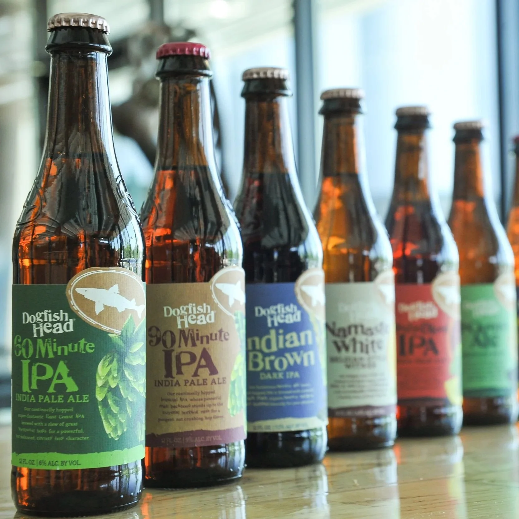
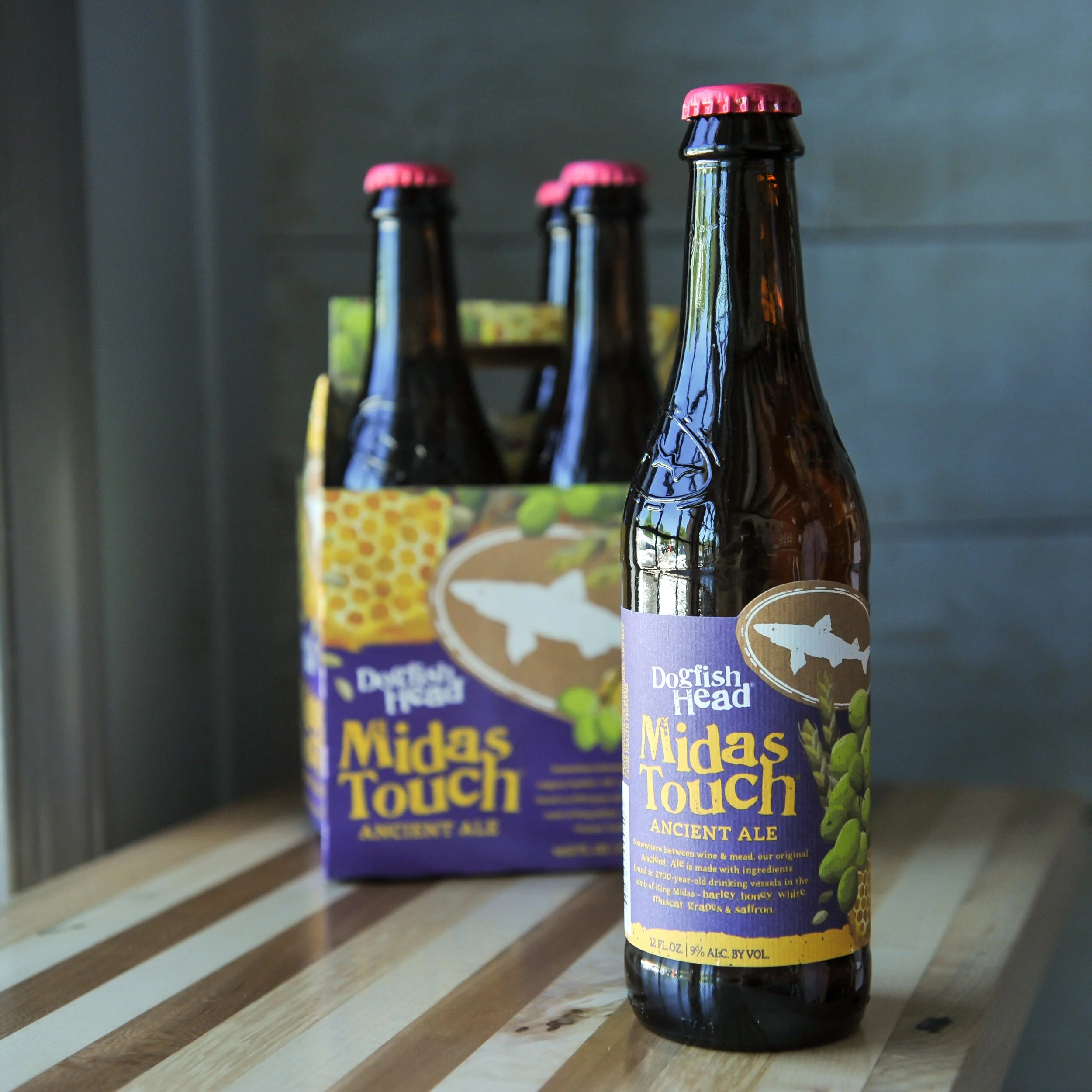
Photos provided by Dogfish Head's press release. Constructed packaging illustrations were outsourced.
Mockups:
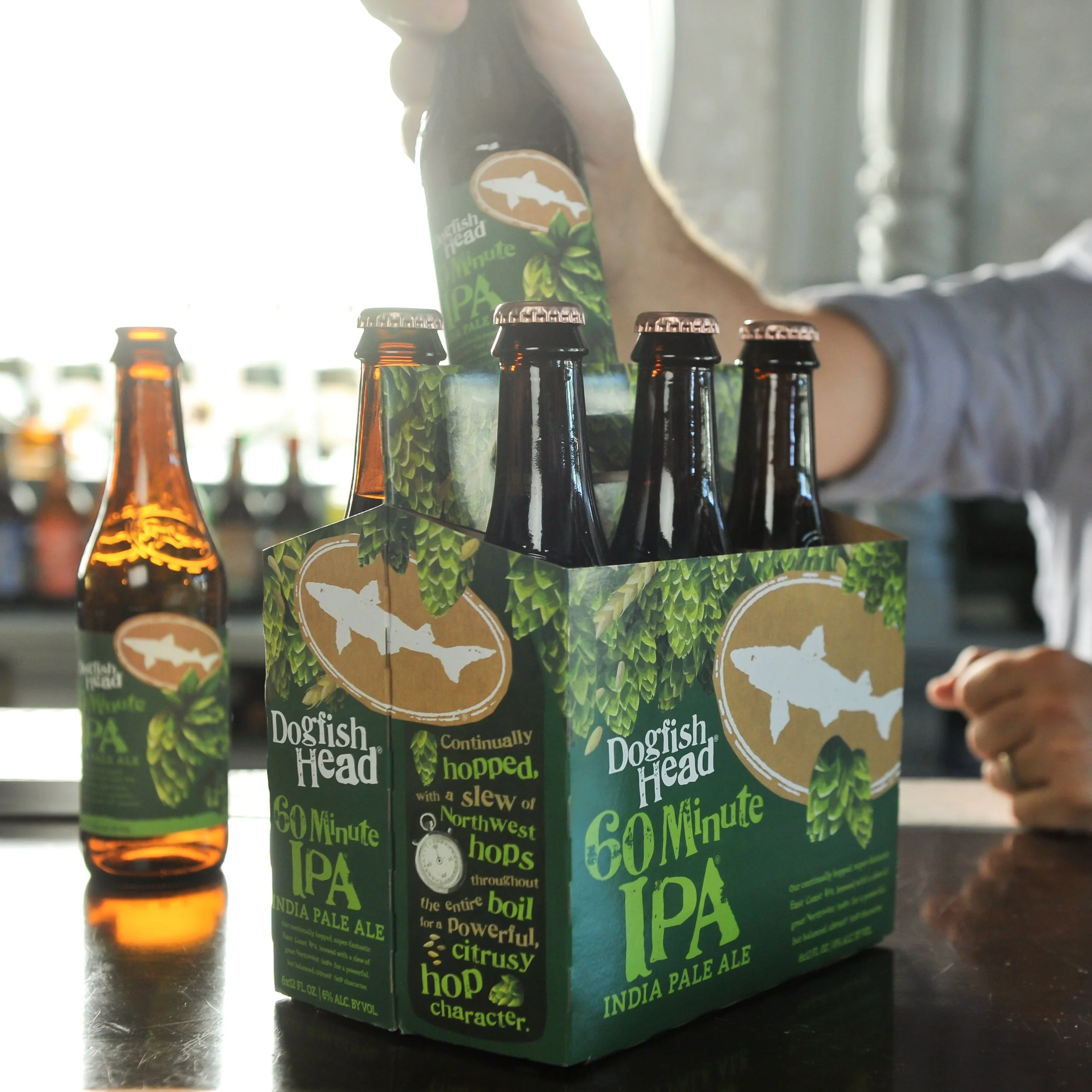
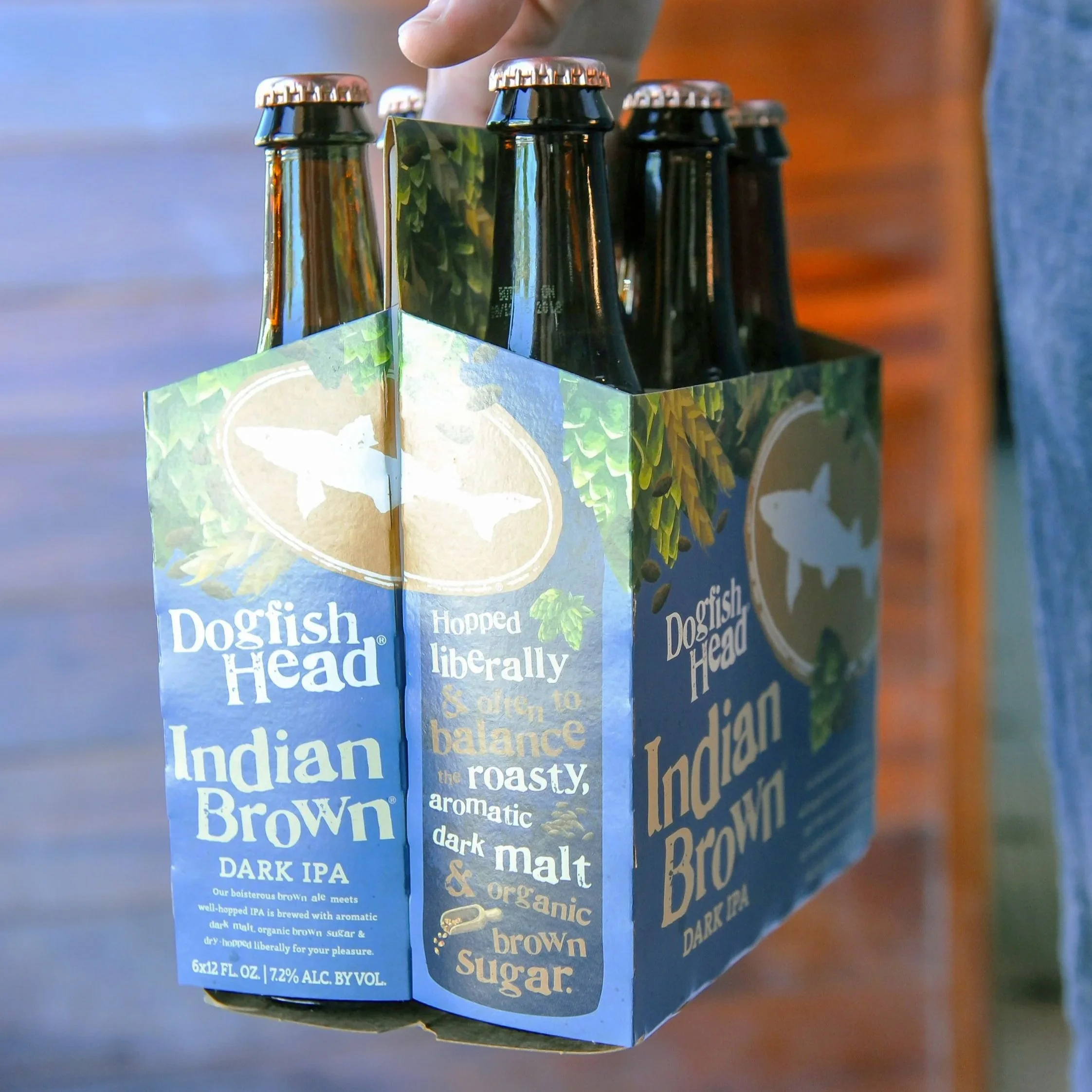
Press release photos:


So. Many. Tiny. Mockups:


Typography mockups:
Seen in the wild, the new packaging next to the old packaging:

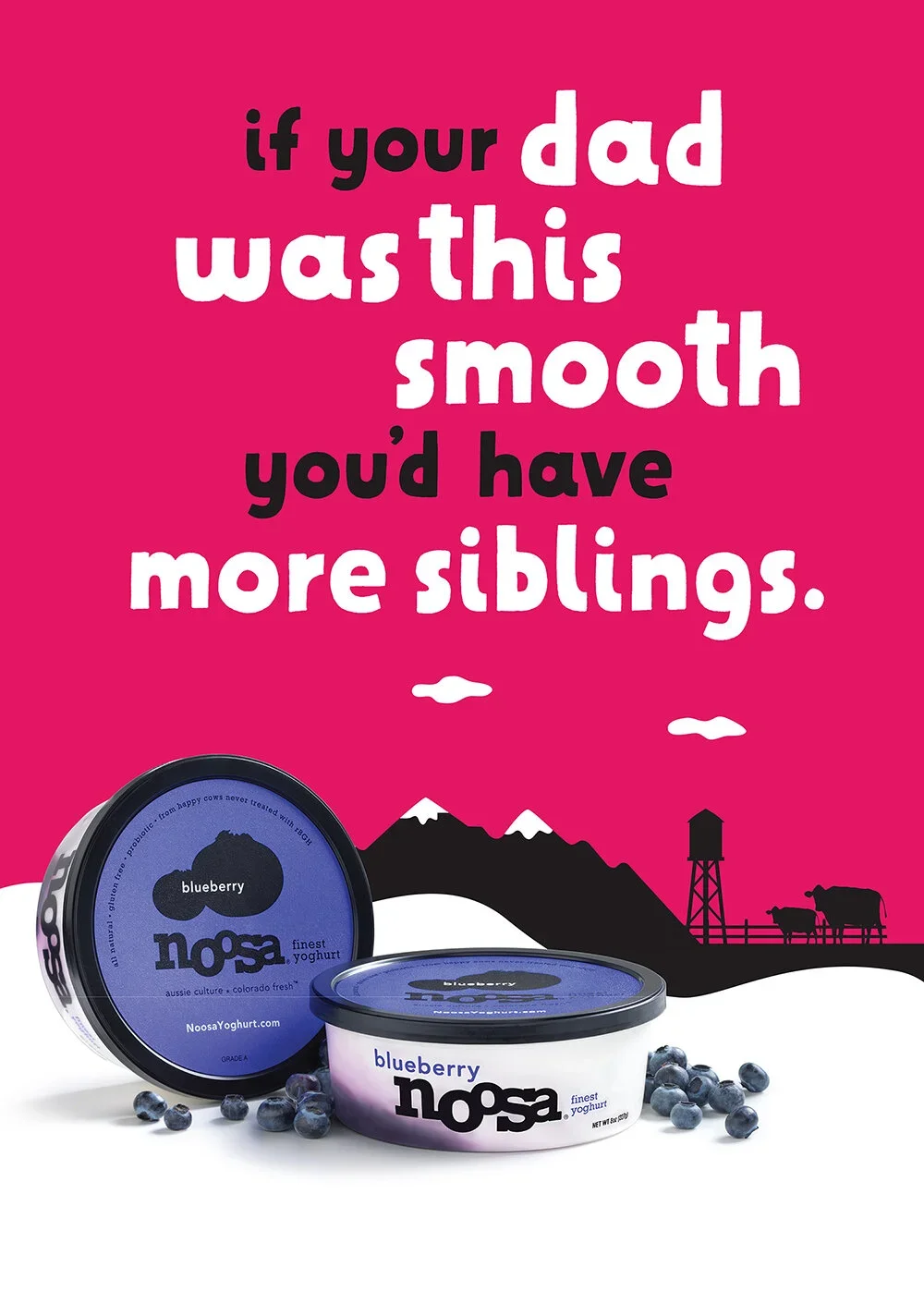
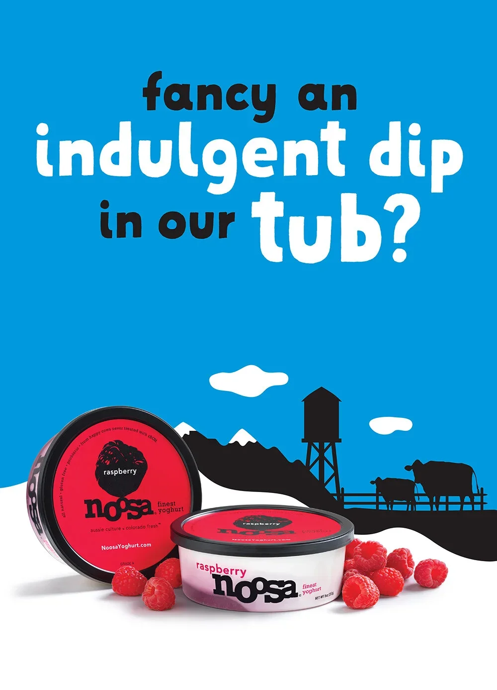
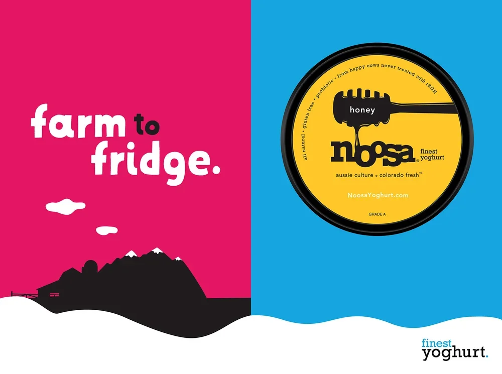
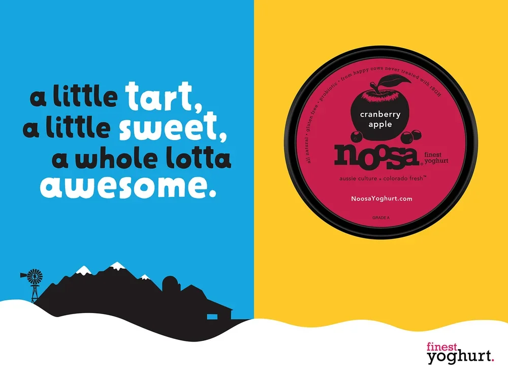
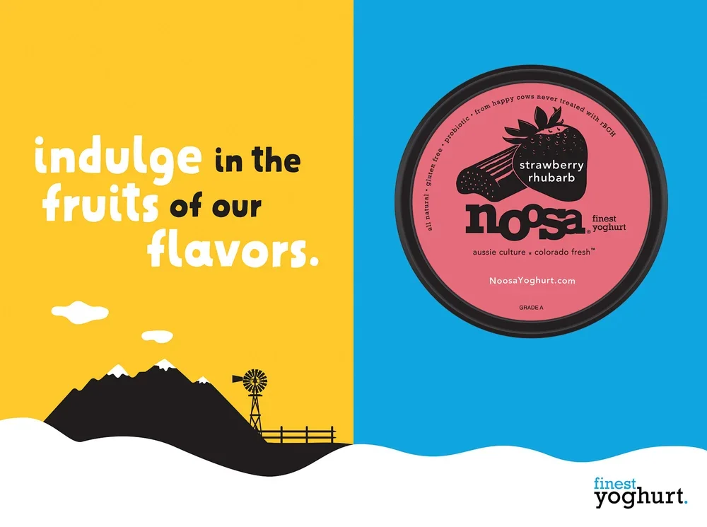
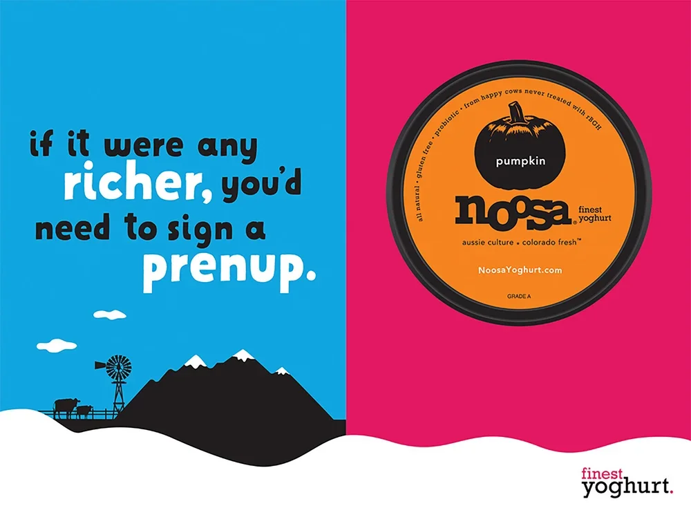
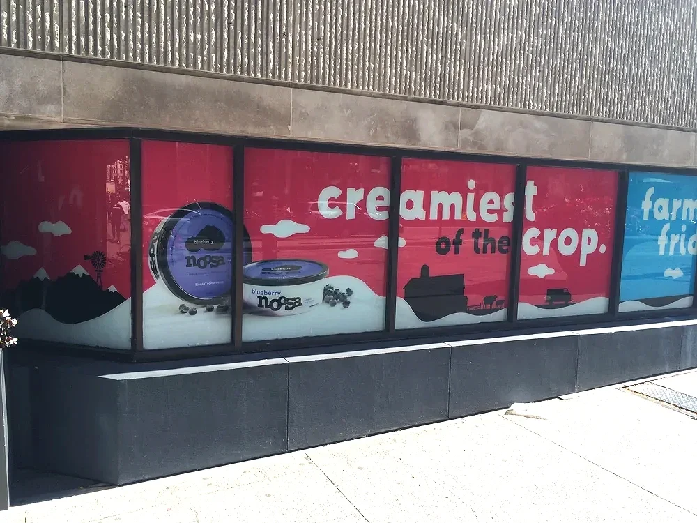
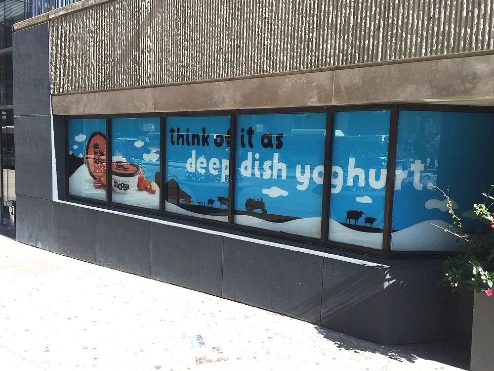
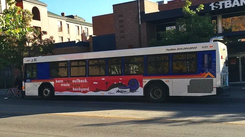
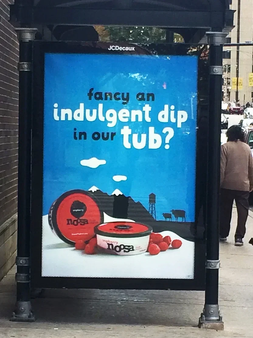
Noosa Finest Yoghurt
Noosa Finest Yoghurt is delicious. But as with many small brands, not enough people knew that outside of its local community in Colorado. In conjunction with Evolution Bureau, I designed bus wraps, billboards, bike racks, building wraps, entire-city-block window displays, train station takeovers, under-the-lid design and digital and mobile ads. Noosa launched in Seattle, Chicago, LA, and Washington DC.

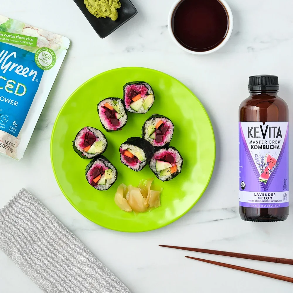
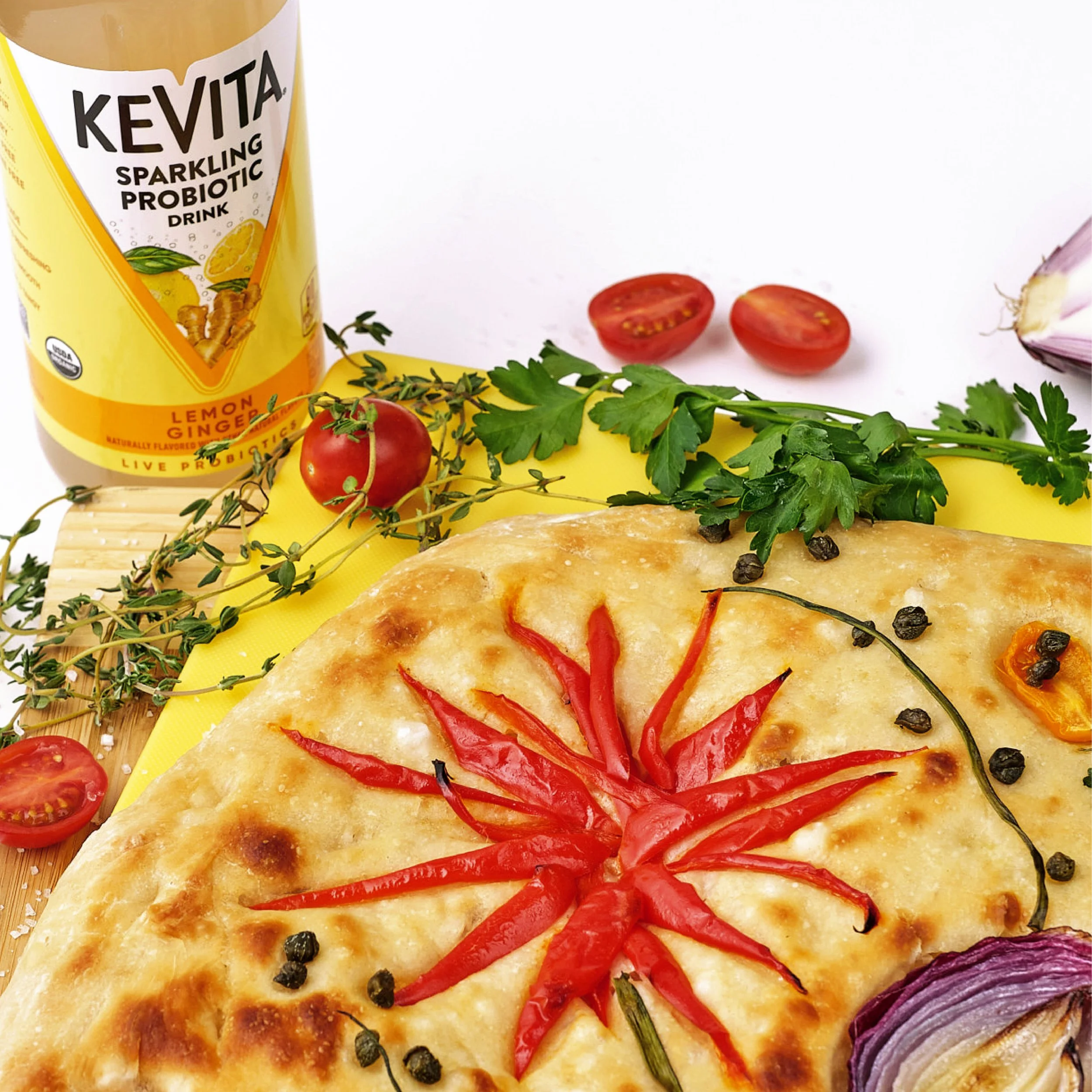
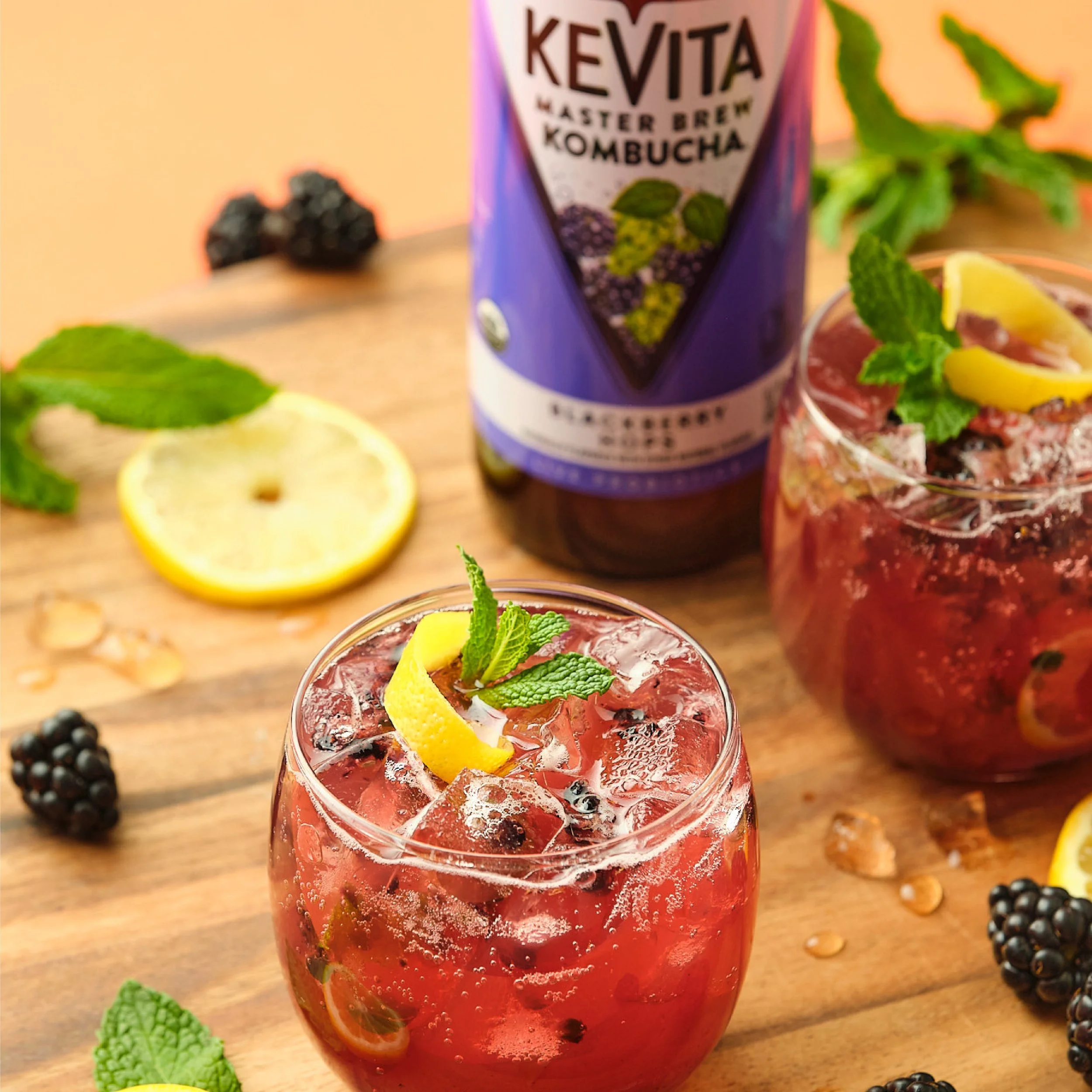
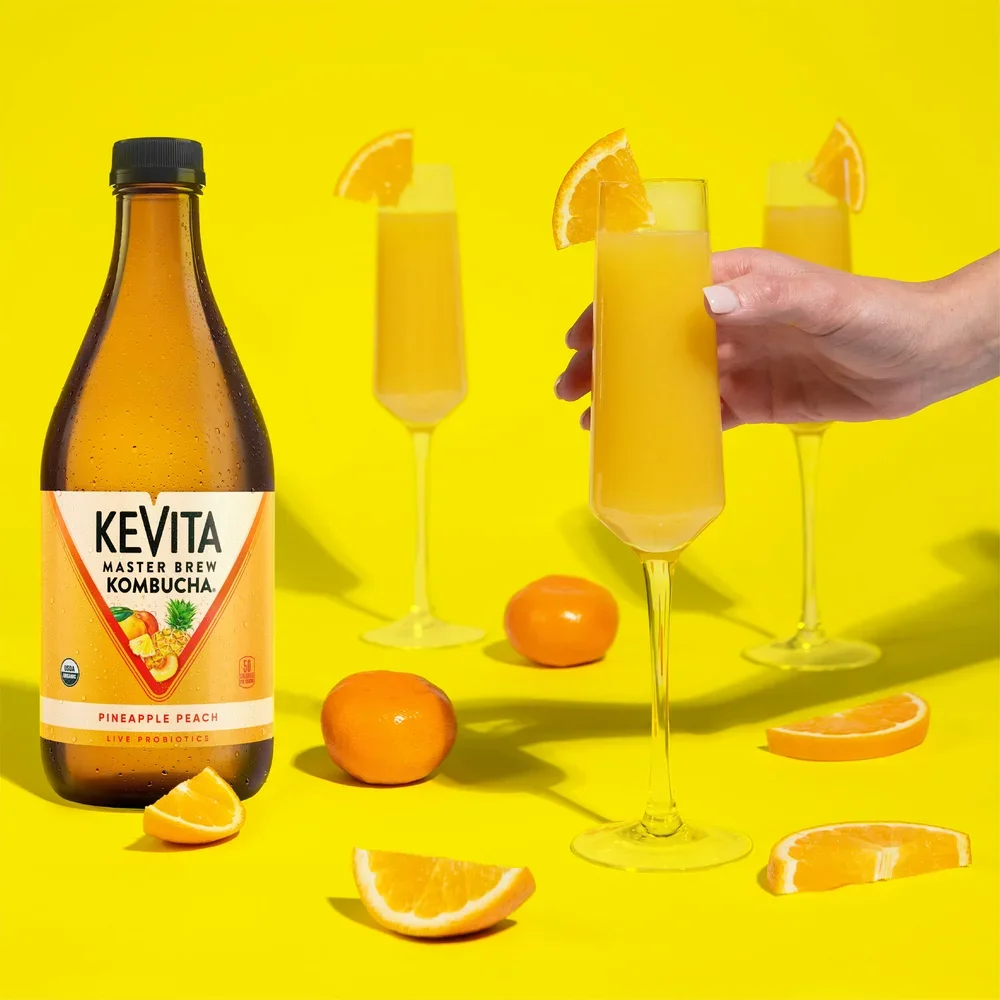
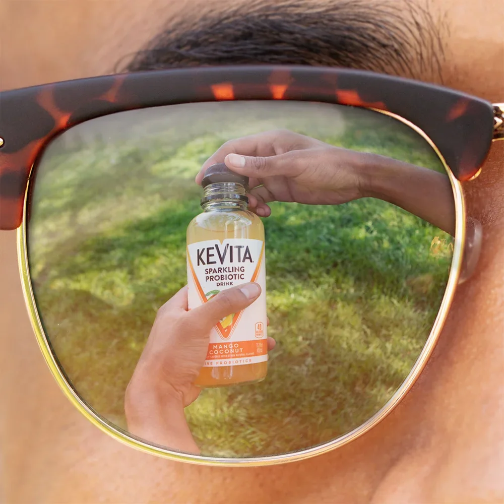
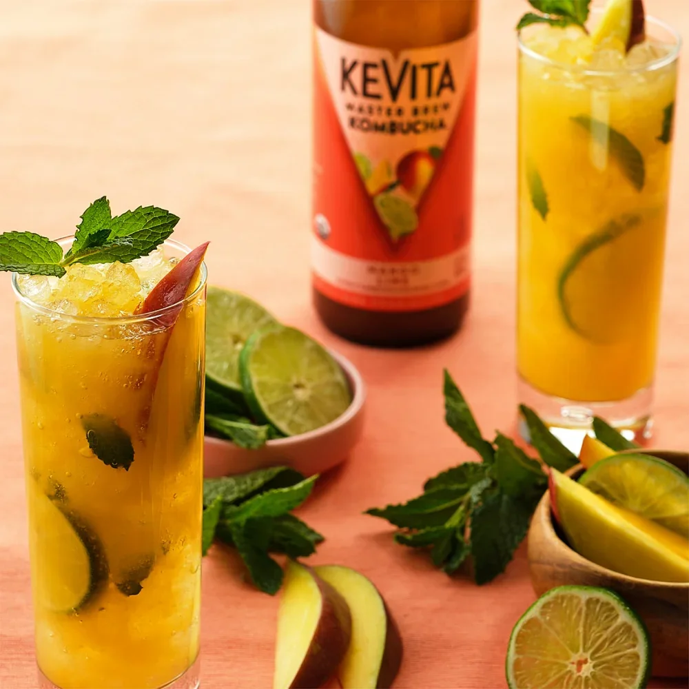
KeVita
While partnering with the Integer Group, I was able to flex my art director muscles for KeVita’s organic social feeds; IG, FB, Twitter, and Pinterest. I got to select and work with talent, photographers, food stylists, producers, copywriters, account people, maybe others, but who could focus with all that delicious gut health around? Social audiences grew from 3k to around 60k by focusing on education, flavor profiles, and lifestyle.


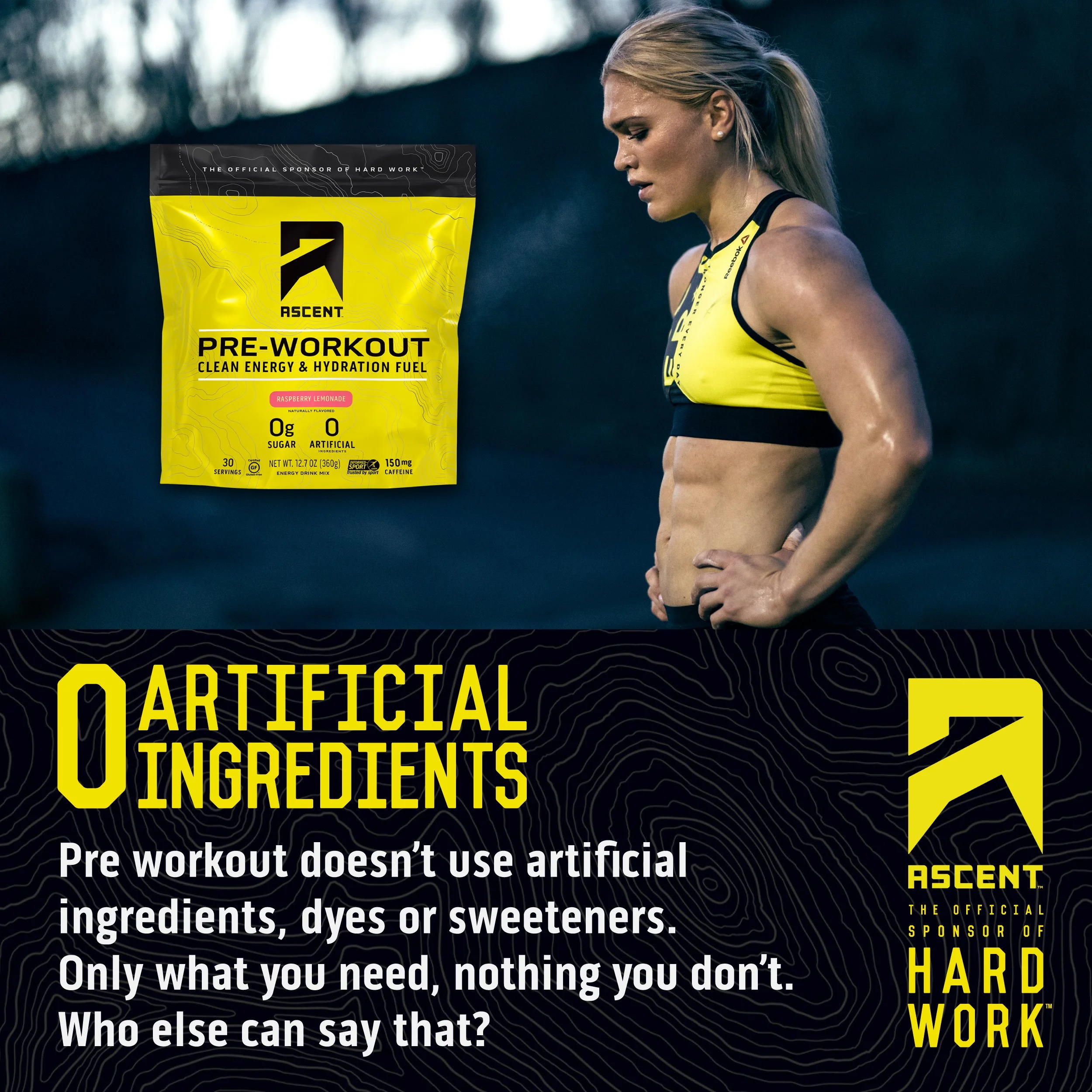
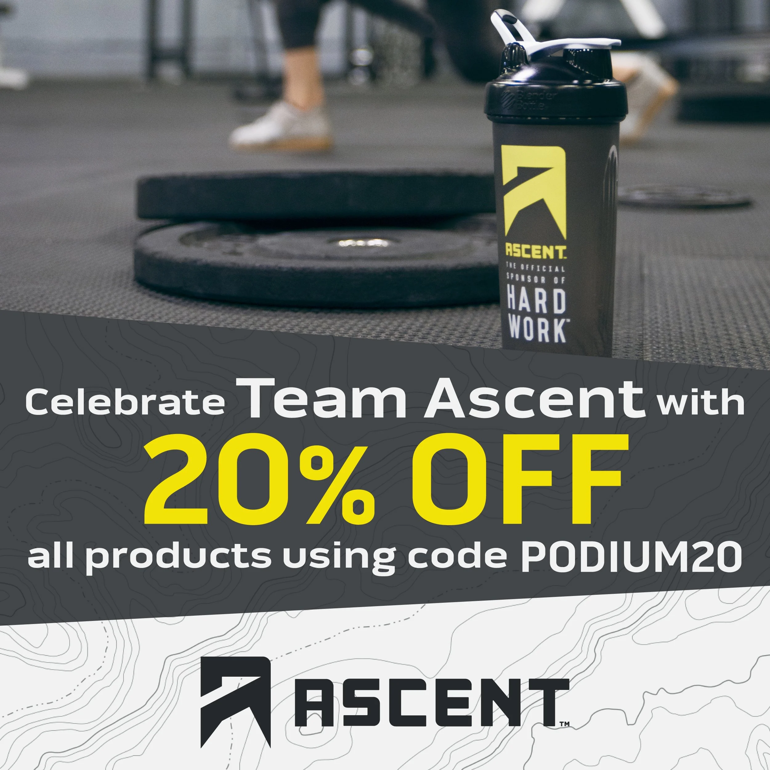
Ascent Protein
Ascent Protein filters their own protein with one purpose: to naturally improve your athletic performance. I worked with Ascent to create digital media that got people pumped about working out. In this time, Our collaboration also saw them get their product into Whole Foods. I designed graphics and wrote copy, advising on tone. I worked out sometimes, but not as hard as Ascent’s athletes. Honestly, look at them.


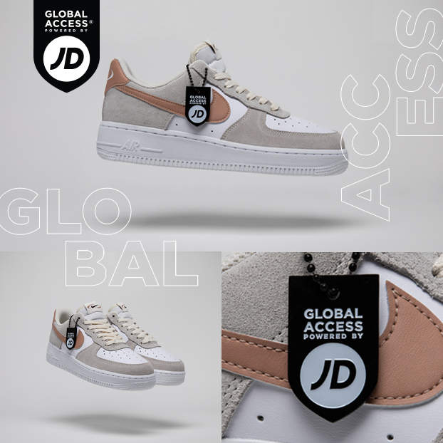
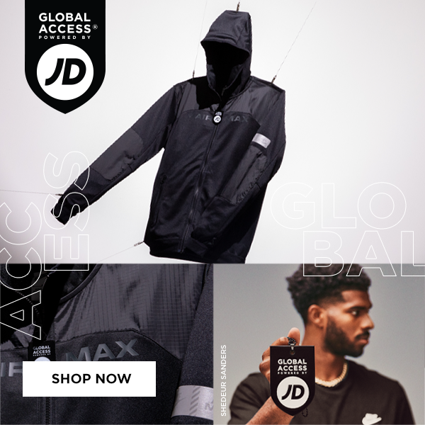
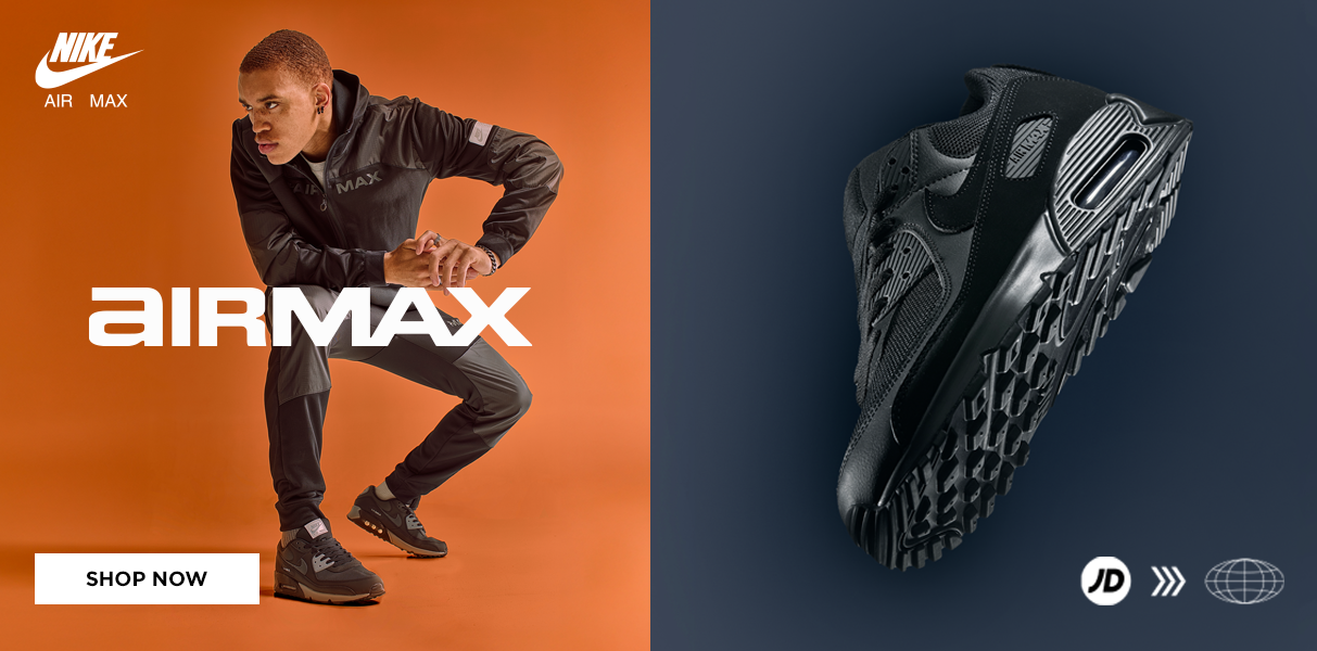
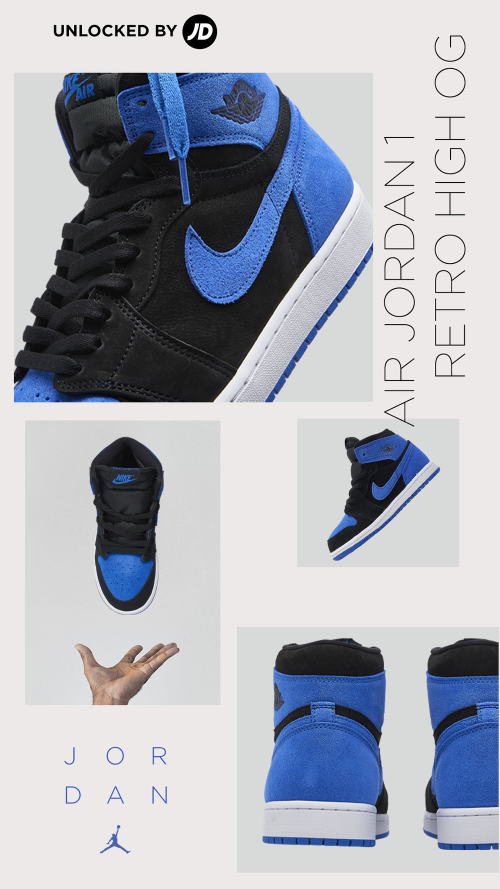
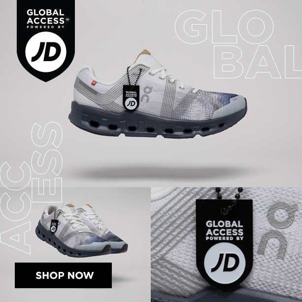
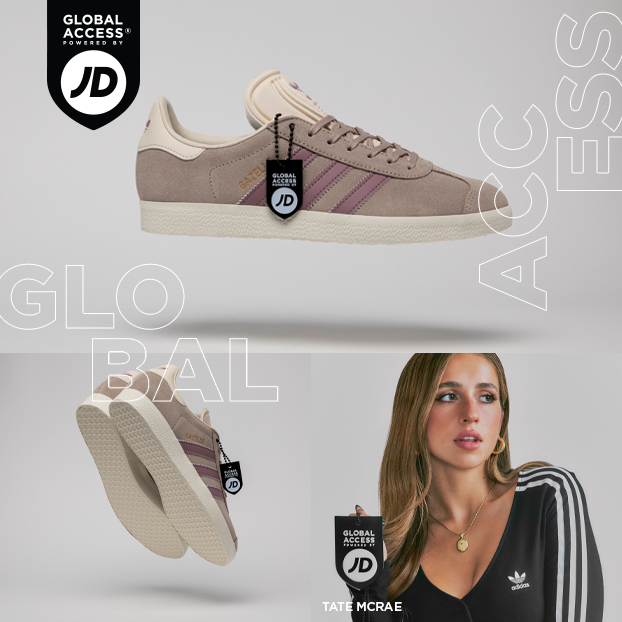
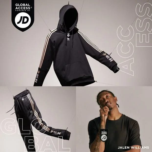
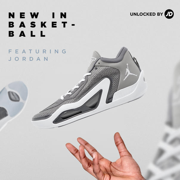
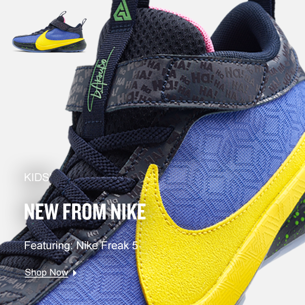
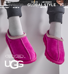
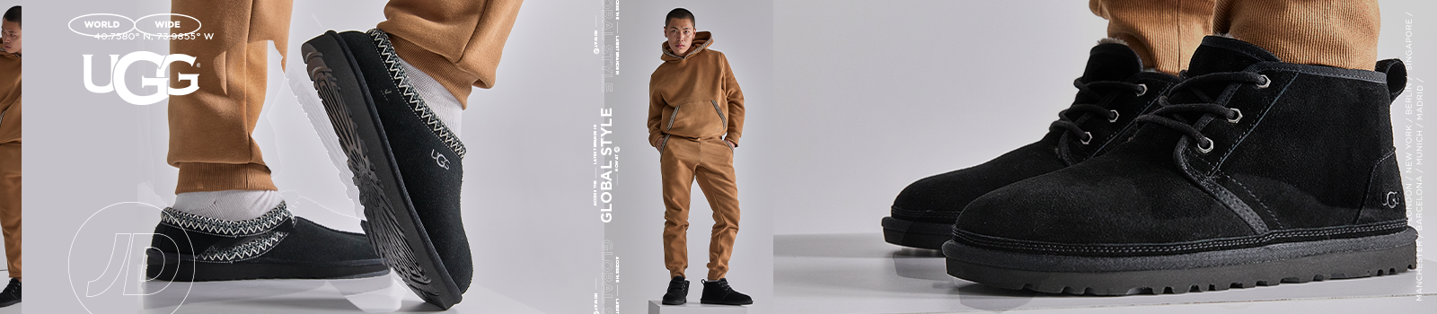
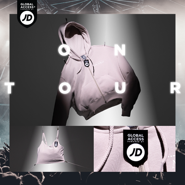
JD Sports
The streetwear business was worth approximately 201.39 billion in 2024*, and it’s only going to rise. Face it, sneakies are cool. I partnered with JD Sports to deliver on their social media and website imagery on a weekly basis, working with some of the biggest brands and names across the globe.


Groundbreakers Landscape & Design (case study)
Overview
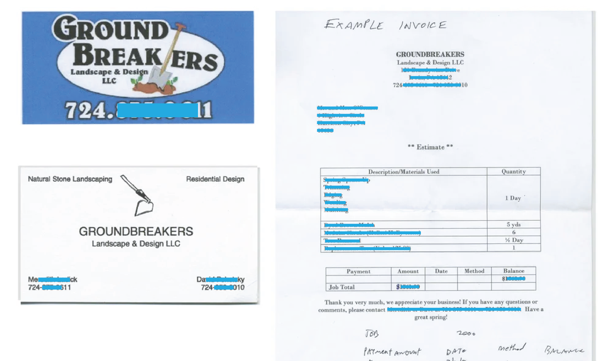
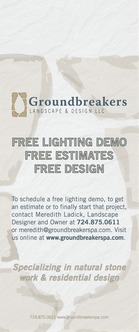
When Groundbreakers Landscape & Design LLC formed, they scrambled to have business cards printed, yard signs made and a website published quickly, without having a brand. They had only just registered their LLC name with the state.
Role:
Design Director
Tools:
Creative Suite
Problem:
When Groundbreakers approached Curious 7, they didn't quite know who they were, they just knew who they weren't.
Solution:
Discover what make Groundbreakers different than the other landscape design businesses in the region and focus on that.
Duration:
Months
Here is what Groundbreakers began their business using, out of necessity:
Discovery
After some interviewing and deep introspection with the two owners, they started realizing what they wanted to say to people. They knew they wanted to showcase their high-end stonework. They weren’t another truck driving around looking to cut your grass and pull your weeds, and they didn’t want green or a tree as part of their identity. Groundbreakers didn’t want to work with commercial spaces. The landscape architect wanted to focus on residential spaces, giving homeowners the yards and gardens of their dreams–the places they could escape to without needing to leave home. A sanctuary at their home address. They wanted the customer to know they’d be getting a professionally and individually designed space, and not a cookie-cutter solution.
Ideation
One challenge would be getting such a long name encapsulated in a mark. Another would be showcasing their specialty while letting people know they were a full-fledged landscape architecture company, not stone masons. It was on to my one of my favorite parts of the brand development process: sketching.


Design
Primary Logo

Secondary Logo

Other Deliverables and Iterations
Business card concepts
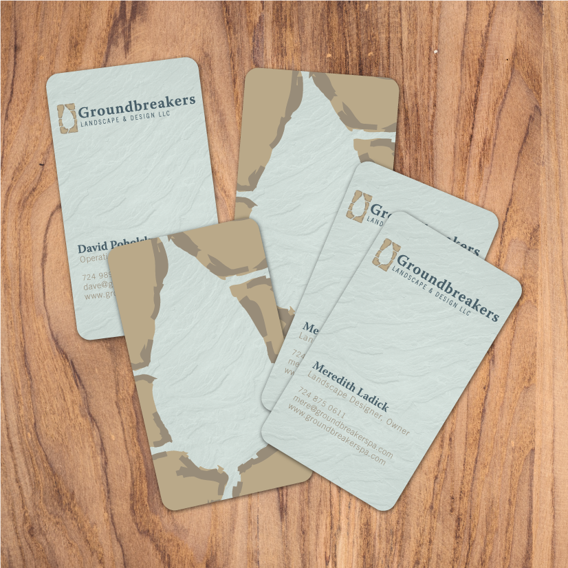
Final Business Cards
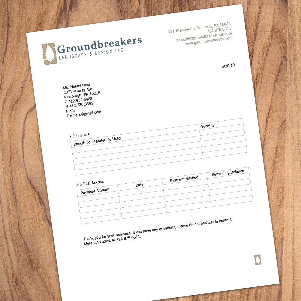
Templated invoice for owners’ ease-of-use
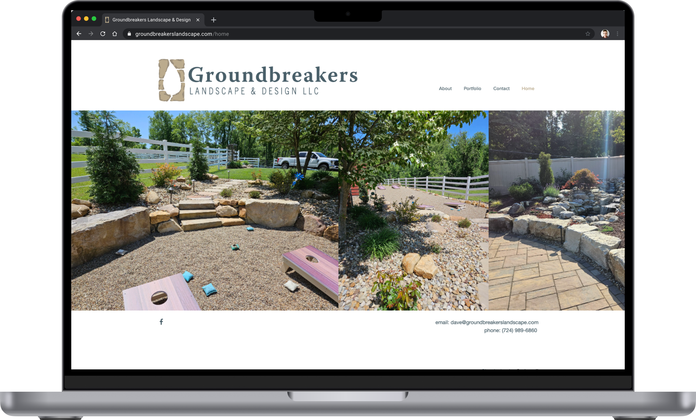
The owner said having a site that was photography-heavy was key in landing new jobs when visiting a new potential client. Being able to quickly scroll through large images to communicate their capabilities did more legwork than trying to explain it to someone who may not understand industry language.
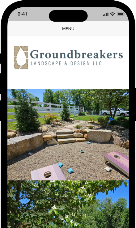
Mobile

Doorhangs
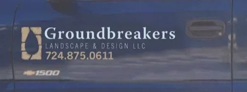
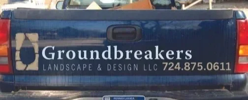
Truck wrap, back and sides
Additional items not pictured included crew hoodies, t-shirts, hats, Facebook ads, and newspaper ads, in addition to regular website updates.
Reflection/Results
After hearing from the landscape architect and owner of Groundbreakers a few months after their new branding, she said business was picking up. Specifically, when they would pin a business card to a supplier community board, it stood out because it was vertical, had texture and color, and had rounded edges. Most of the other cards pinned to those types of community boards were horizontal, had square edges and were white, like Groundbreakers’ old card, often printed using an office supply store like Staples. Generic, a dime a dozen.
They’ve been steadily booked for two decades. They’ve added trucks. They stopped renting equipment and purchased their own. In a world where small businesses come and go, theirs is a success story in hustle, hard work, and standing out.
ZeroNorth
While the graphic ended up looking fairly simple–which was the point–it was anything but. Working closely with the CTO of ZeroNorth, our end goal was a piece that could be used to make what they did digestible for non-engineers as they tried to make their way into the software security market. Relying heavily on my mathematics background, I had to make sure the left and right sides of my brain played nicely with each other so that the end infographic made sense regardless of the viewer’s job title and experience.

Logos
Various logos I’ve designed.