

FitGear Hub
A B2C web and mobile online store focused on high-performance fitness gear and accessories for athletes and fitness enthusiasts.
Overview
FitGear Hub is a B2C web and mobile online store focused on high-performance fitness gear and accessories for athletes and fitness enthusiasts. Users need durable, high-quality equipment that enhances their workouts. FitGear Hub assists by providing detailed product descriptions, expert recommendations, and customer reviews, enabling them to confidently select the best gear for their training needs.
Role
Product Designer and UX Researcher
Tools
Figma, Adobe Illustrator, Adobe Photoshop
Duration
~1 weeks
Problem
It’s overwhelming to search an e-commerce site with a robust product line. It’s necessary to have navigable filtering and sorting features to find the products a consumer wants/needs. Consumers must be able to minimize what they see to reduce overwhelm and fatigue; 30% of shoppers use filters to narrow options. Additionally, within a product, there may be many options. These need to be easy to understand and select.
Solution
FitGear Hub is a web and mobile platform that helps fitness enthusiasts solve these problems by:
Providing consumers with a robust filtering system with several useful categories to narrow searches.
Allowing users to search or filter results based on budget.
Showing product details and options clearly and succinctly so consumers know what options are available and what they’re selecting and adding to their cart.
Discovery
Research
I researched to understand what causes overwhelm for consumers when they’re shopping for fitness equipment.
User Challenges
Using e-commerce websites, I identified key challenges:
There are too many products to sift through.
Many products seem very similar to one another. This can confuse consumers new to fitness.
There are a lot of options available within certain products, and consumers don’t know what they need or might not be able to clearly navigate the product page.
Jobs to be done
I used Jobs to be Done to pinpoint when consumers face challenges, helping identify core needs and effective solutions.
When searching for equipment, I want to find equipment based on my experience level.
When searching for equipment, I want to be able to search based on the type of workouts I want to do and the amount of money I want to spend.
When I’m looking at a product, I need to know what options are available.
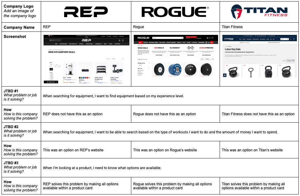
Competitive Analysis
I conducted competitive analysis of three popular companies—REP, Rogue, and Titan Fitness—to understand existing features and identify areas for improvement.
Ideation
How Might We Statements
“How Might We” statements reframed consumers’ challenges as opportunities for solution-focused design. They prioritized user needs, encouraged innovation, and streamlined the design process by removing unnecessary steps.
HMW #1 Capability:
Pain Point: Consumers are unsure of where to begin a home fitness journey.
HMW Statement: How might I help users begin their fitness journey?
Have a filter that divides equipment into categories based on the complexity of use and exercises performed.
HMW #2 Capability:
Pain Point: Consumers need to be able to find equipment that helps them work out how they enjoy doing so.
HMW Statement: How might I provide consumers with the type of gear and equipment they need to enjoy fitness their way?
Have a filter that allows the user to select what type of fitness routine(s) interest them.
HMW #3 AI Capability:
Pain Point: Consumers are on a specific budget. and fitness equipment is expensive.
HMW Statement: How might I assist consumers in staying within their allotted budget?
Have a filter that allows users to have a bottom and top range for price.
Have a sort feature that allows users to show equipment and gear from highest to lowest or lowest to highest price.
Brainstorming
I did a lot of research and annotation for a sense of what competitors and other successful brands were doing on their e-commerce sites.

Design
Wireframes
Wireframing was vital for the quick creation of elements. With user experience top of mind, I continued to refine actions and elements by paying close attention to hierarchy.
The transition from lo- to med-fi included adding real text for placeholder shapes, beginning to develop icons and buttons, refining spatial hierarchies, adding the status bar at the top and the nav bar at the bottom, aligning objects to a grid system, specifying input fields, etc.
I was beginning to learn what elements were taking up too much space, what elements needed more space, what fields would need more breathing room, etc.
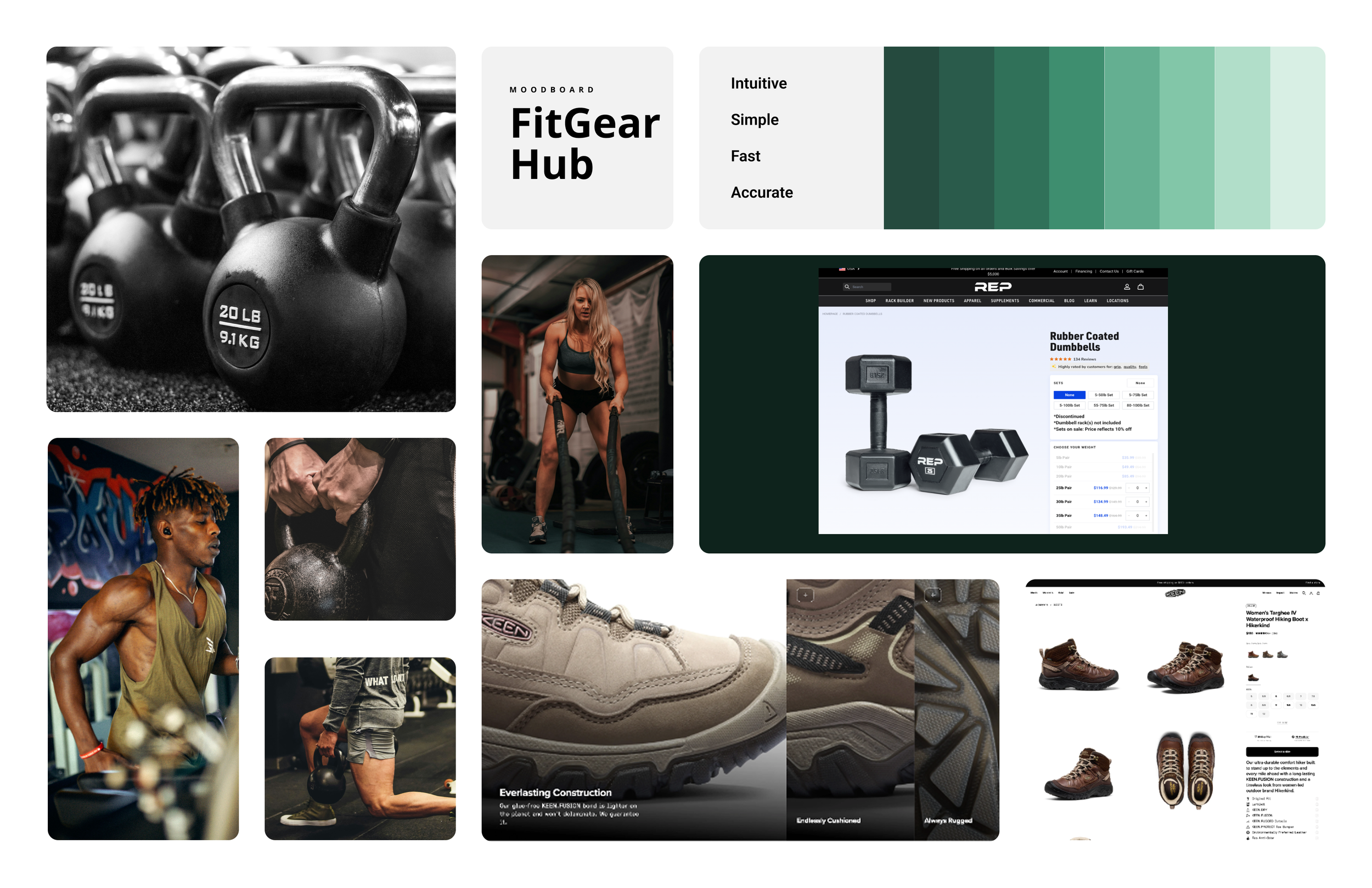
Moodboard
I created a moodboard to communicate a deeper sense of user personas, design styles/inspiration, and brand personality. I wanted to get a sense of color palette, design aesthetic, and user expectations.
I created the moodboard to visually represent aesthetic, style, and mood for FitGear Hub. The inspiration was to create a design that is clean, inspiring, and user-friendly, while making sure not to alienate anyone based on gender norms.
Brand Platform
I created a brand platform to communicate what FitGear Hub is, what problems it solves, and how. FitGear Hub is a place where fitness enthusiasts go to make informed decisions about their home fitness needs. I chose this vision because there is so much out there in a crowded market, and it can become overwhelming. FitGear Hub is a platform that connects consumers with equipment and gear to help them achieve their fitness goals.
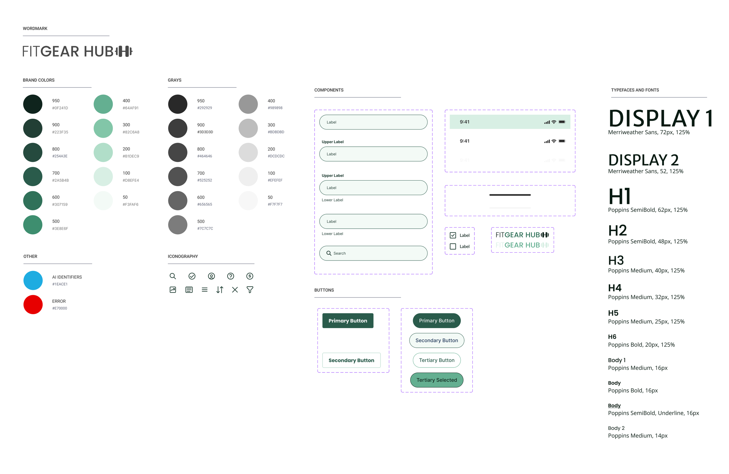
Style Guide
FitGear Hub’s style guide was created to ensure consistency within the platform's design elements and to make sure screens were designed cohesively. This enhanced the user experience by creating consistency across pages and between mobile, tablet, and desktop.
Colors were selected to appeal to all genders–more specifically, to not alienate any gender.
Poppins has several font weights and styles, so it made sense to use it for its variability across platforms and sizes.
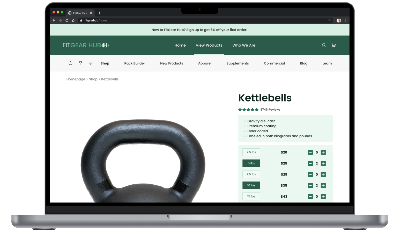
Hi-fi wireframes
I created hi-fi screens to show real-world versions of how the platform would look and perform. The transition from med-fi and hi-fi integrated FitGear Hub’s color story, typography, full iconography, and photography. The style guide was crucial for maintaining consistency across elements like iconography, typography, colors, imagery, and layout. Transitioning from med-fi to hi-fi designs, I refined elements according to the style guide and incorporated additional details like stroke weight and corner properties to give the design a polished look.
Throughout this transition, I could see the significance of attention to details such as type, spacing, color consistency, and alignment. This reiterated my understanding of the profound impact these nuances can have on the overall aesthetic and functionality of the design.


Testing
User Input
User input was conducted to identify preferences in platform design options. Three participants were recruited via personal outreach.
Participants were asked about 3 items:
They were asked to choose between two different product page designs.
They were asked to point out any confusion while trying to select options for a product with multiple configurations (different weights, colors, and quantities).
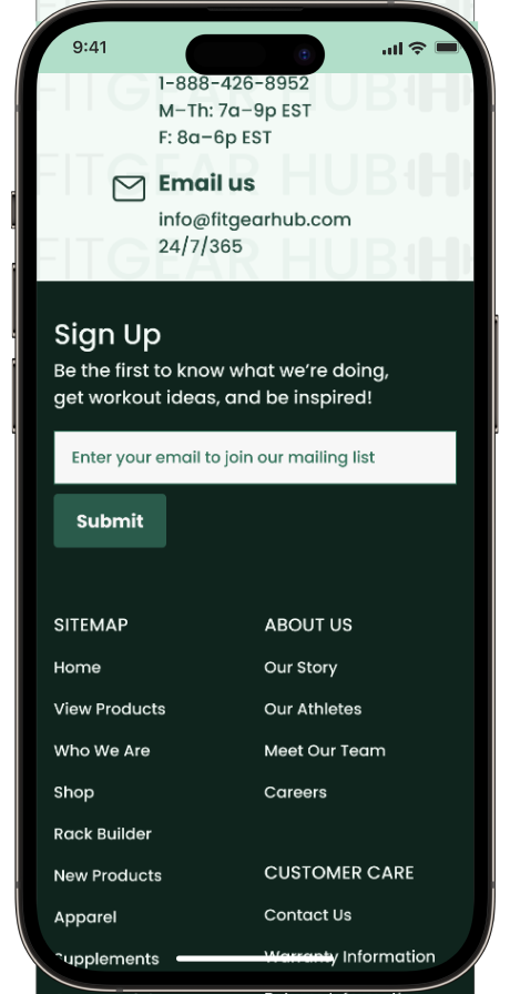
Testers were asked about the email subscription placement.
Original Concepts
Testing Outcome
Overall, the first concept was preferred, but edits were made.
The design of the first card was preferred, but it was simplified.
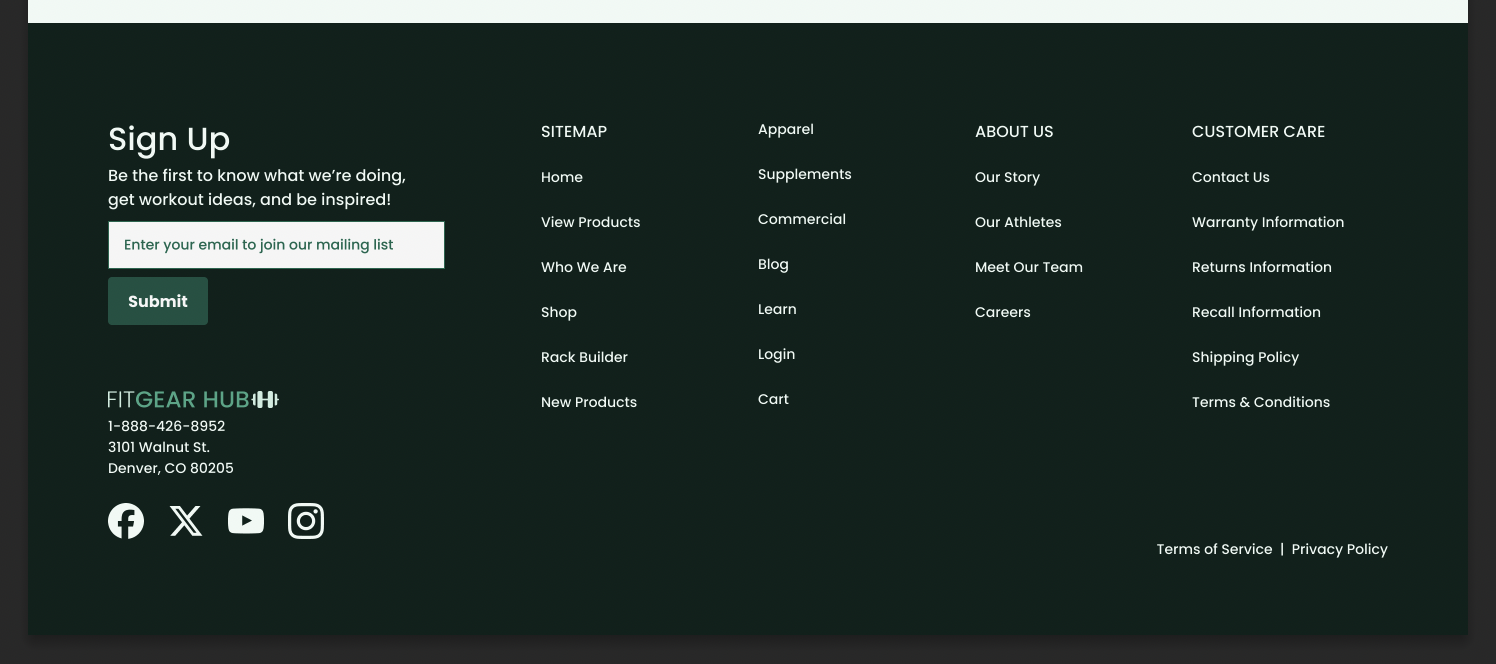
Placing the option to sign up for email updates in the footer was preferred (option 2).
Redesign
After testing was completed, I incorporated feedback and iterated on the design to create versions that better meet user needs and expectations.
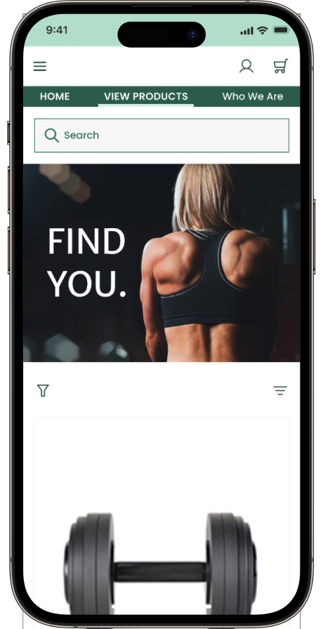
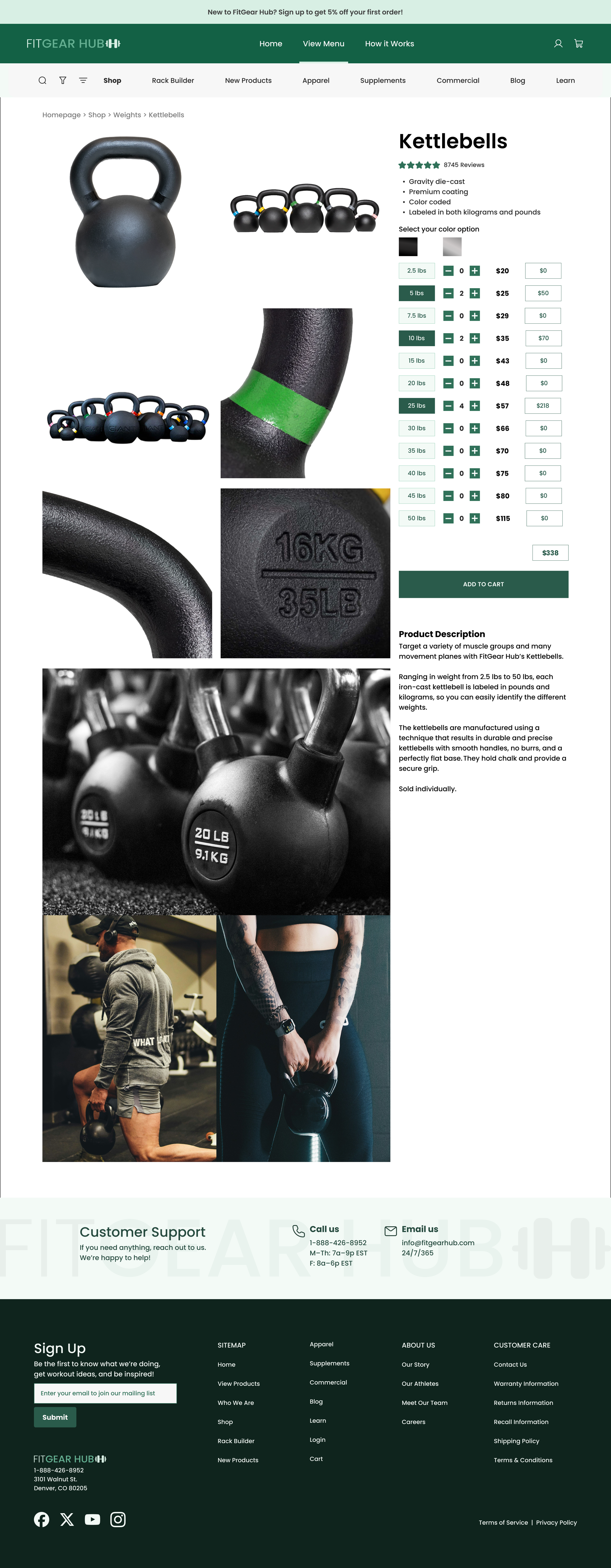
Issue 1: The first concept was preferred by all 3 users, but one suggested moving the carousel up and under the large hero photo, thereby saving vertical space.
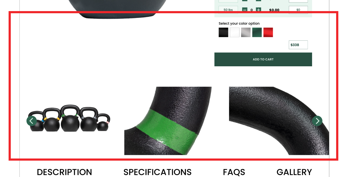


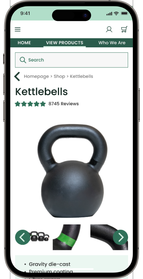
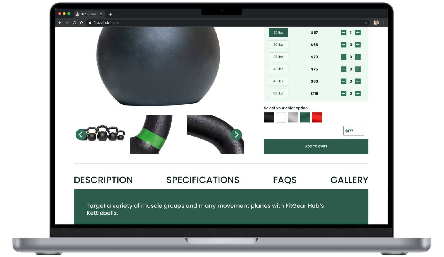
Issue 2: The card that had all the product options seemed overwhelming and needed to be simplified. The per unit column was removed since it was determined to be unnecessary.


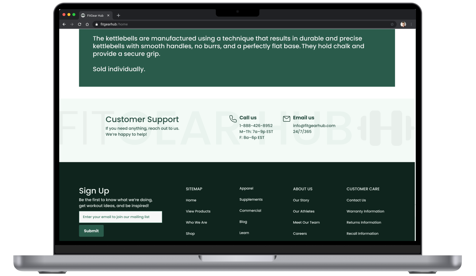
Issue 3: The email subscription signup was interruptive to the contact information, so it was moved to the footer (like in the 2nd initial concept) to minimize interruption.
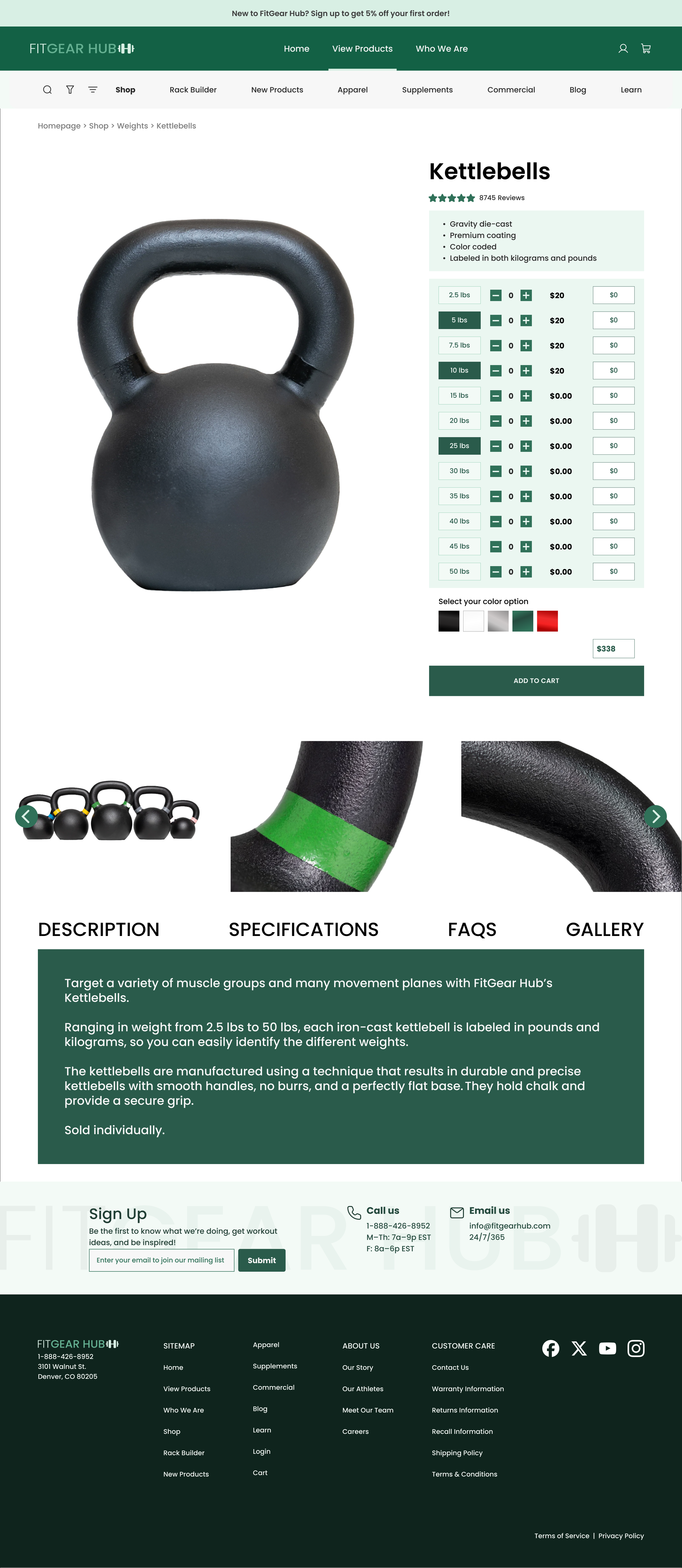
The final page:

Reflection
This project provided a unique opportunity to dig into what appealed to consumers and combine their feedback into successful web and mobile solutions. With the user's needs top-of-mind, clarity and simplicity were the primary goals to achieve, and the filter and sorting functions helped to that end. In a market saturated with products and variety, being able to cull, then sort, this list is paramount.
I enjoyed the logic this project required. Configuring the product cards was an exercise in putting the user experience first by making it as comprehensive, yet as simple as possible.