


Overview
Trottr is a web and mobile platform that gets adventurous travelers to unique destinations, specifically curated for them, and immerses them in the local culture, keeping them away from tourist traps.
Role
Product Designer
Tools
Figma
Illustrator
Duration
5 weeks
Problem
Adventurous travelers struggle to locate services that find them off-the-beaten-path destinations curated just for them, that immerse them in local culture and keep them away from tourist traps and “Top Ten” lists.
Solution
Trottr extensively interviews each user on their travel preferences and hobbies to curate trips specifically for them
Trottr leverages AI to use users’ travel histories to make recommendations based on how they enjoyed previous trips
Trottr provides GPS navigation services
Trottr provides real-time weather updates for users
Discovery
Research
I conducted research to understand what frustrates travelers from seeking out trips or disappoints them when they take them. Key questions focused on how travelers choose destinations, how they decide what to spend, and what level of luxury they expect/prefer. Additional questions explored user preferences around travel, including activity level, type of social engagement, and style of eating. The 10–15 minute survey was shared via general online forums and my personal network.
User Challenges
Using websites and guidebooks, I identified key challenges: planning interesting and unique trips, navigating to remote locations, and local customs.
Jobs to be done
I used Jobs to be Done to pinpoint when users face climbing challenges, helping identify core needs and effective solutions.
When planning a trip, I want to go somewhere unique and interesting
When planning or on a trip, I want to feel confident navigating remote locations
When on a trip, I want to adhere to local customs
Use cases
Jobs to be done guided Trottr’s design, ensuring the platform remained on-task, streamlined, and equipped with features that truly add value. Use cases were developed to make sure its capabilities aligned with users’ specific goals and challenges, illustrating how it supports them in real-world scenarios.
User need 1: The user wants to go somewhere unique and interesting, curated just for them.
Context: The user is in planning stages (with access to wifi) and is looking to go somewhere they’ve never traveled to previously.
Platform capabilties: Can make trip suggestions based on user data (travel history, user preferences, etc.).
User need 2: A user needs to know how to navigate in remote areas.
Context: While traveling, the user may not always have access to wifi.
Platform capabilities: Will provide GPS to guide the user whether there is wifi access or not.
User need 3: The user wants to learn about local customs.
Context: While traveling, or in preparation for traveling, the user wants to immerse themselves in local culture and customs to be as respectful as possible.
Platform capabilites: Will supply the user with local customs and cultural norms for all trips that can be planned using the platform.
Ideation
Brainstorming
While brainstorming, I centered all the knowledge gained to this point to make sure the platform was meeting user needs.
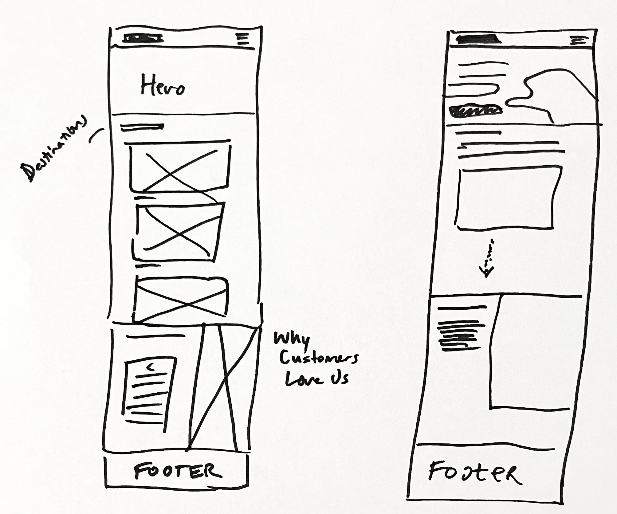
Sitemap
The sitemap was created to help visualize what form the platform will take, organizationally. Through this, I could outline hierarchy to ensure users could find what they were looking for. The sitemap was a great tool to make sure everything got included and was a way to show the overall structure of the app.
I created the sitemap to coordinate the app’s content in a logical way. This assured users would be able to navigate seamlessly to locate what they need. The map also defined the relationships between pages, clarifying the app's organization.

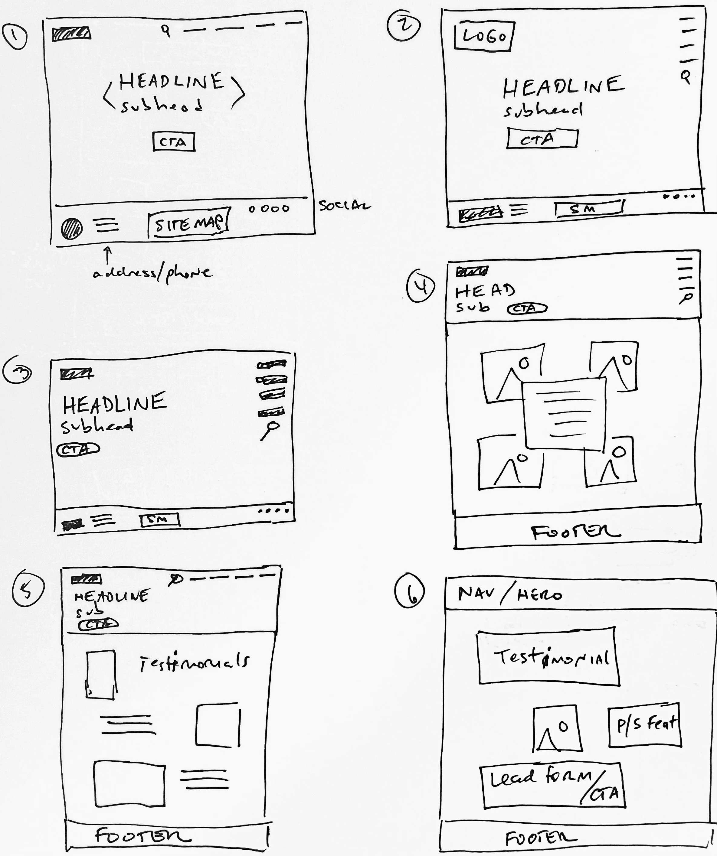
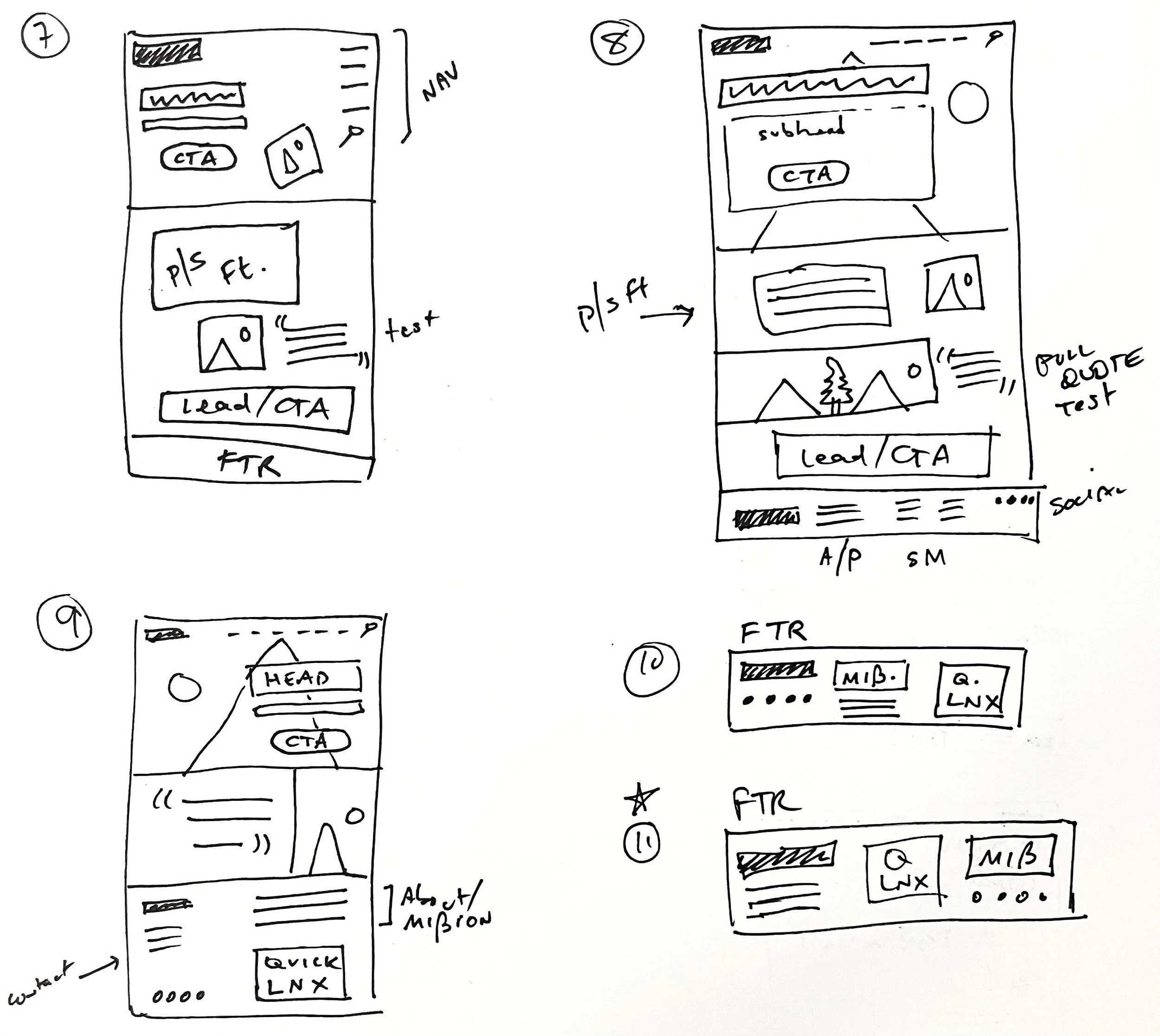
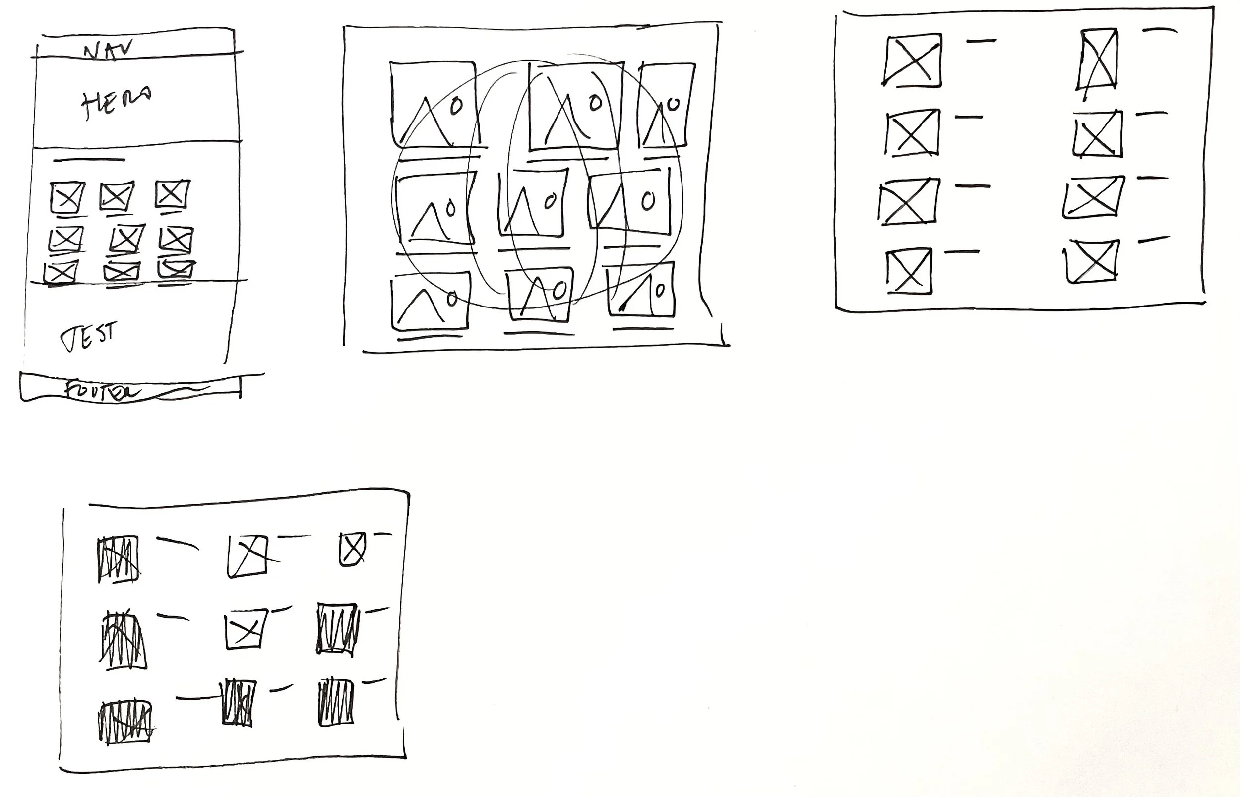
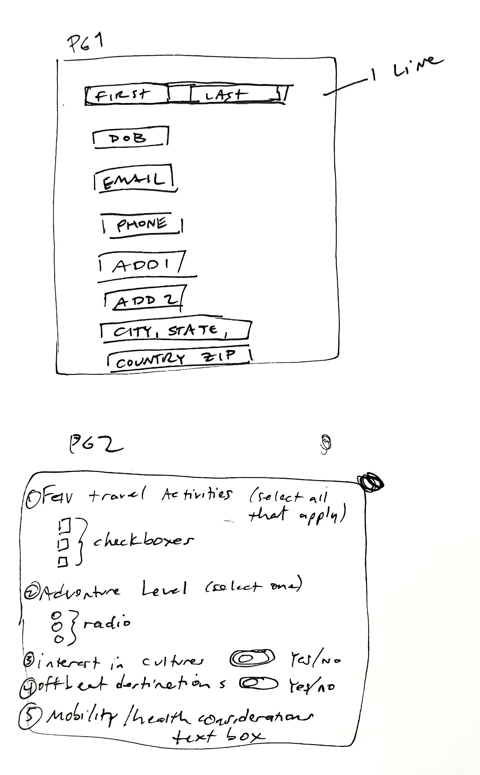
Sketches
I started sketching as the quickest way to begin visualizing what a physical design might look like. Pencil and paper was the best way for me to actualize ideas; using software often takes longer to get designs down. Sketches were iterative because I kept changing revising initial sketches. It was a great way to start visualizing user flow in a concrete way. Sketching was a rapid way for me to see how to get the most-sought-out features in front of the user, while making secondary and tertiary features accessible in a sensical way, but keeping them from being intrusive to the primary features.
Design
Wireframes
Wireframing was a vital step in my process, allowing for quick creation of elements. With user experience top of mind, I continued to refine actions and elements by paying close attention to hierarchy.
The transition from lo- to med-fi included adding real text for place holder shapes, beginning to develop icons and buttons, refining spatial hierarchies, adding the status bar at the top and the nav bar at the bottom, aligning objects to a grid system, specifying input fields, etc.
I was beginning to learn what elements were taking up too much space, what elements needed more space, what type fields would need more breathing room, etc.

Brand Platform
I created a brand platform to communicate what Ventur is and what problems it solves–and how. Keeping its mission and vision at the forefront of the design process kept me focused on the defined goals. Ventur sees a world where climbers use technology to help them make informed plans to navigate properly and climb safely and enjoy the outdoors. I chose this vision because safety shouldn't be compromised. Ventur is a product that connects technology with climbers to help them achieve their goals through accurate information and access. Ventur is your climbing partner who has been everywhere, climbed everything, and remembers all the details.
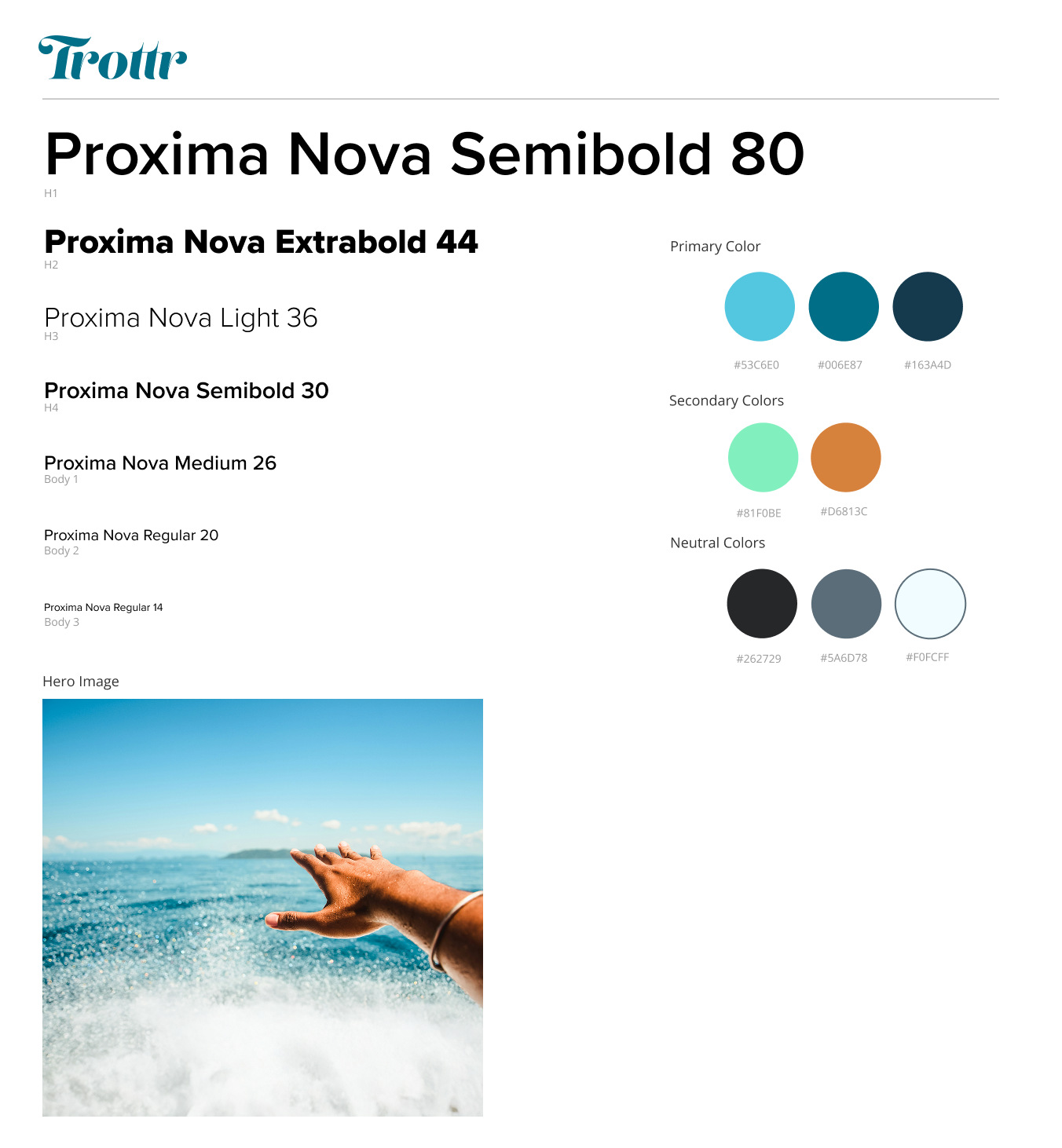
Style Guide
Trottr’s style guide was created to ensure consistency within platform's design elements and make sure screens were designed cohesively. This enhanced the user experience by creating consistency across pages. My brand platform provided much of the foundation in the mission and vision; from the mood board, I was able to select colors directly from the images of natural rock that represent strength and reliability, as well as the natural world.
The style guide provides color builds and typography to make sure any designer could enter the process and design within Trottr’s brand personality.
Hi-fi wireframes
I created hi-fi screens to show real-world versions of how the app would look and work. The transition from med-fi to hi-fi integrated Trottr’s color story, typography, full iconography, and photography. The style guide was crucial for process. Transitioning from med-fi to hi-fi designs, I refined elements according to the style guide and incorporated additional details like stroke weight and corner properties to give the design a polished look.
Throughout this transition, I could see the significance of attention to details such as type, spacing, color consistency, and alignment. This deepened my understanding of the profound impact these nuances can have on the overall aesthetic and functionality of the design.


Reflection
Designing Trottr was a refreshing look into an oversaturated market. Being able to work with a different user than is standard was a good way to make a different product.